In the first part of this series, we looked at how to use Apple’s Developer app in preparation for WWDC. Here’s how to use the tvOS version on the Apple TV.
The version of Apple’s Developer app for Apple TV is similar to the iOS and macOS versions, so we won’t cover every detail here. Instead read Part 1 of this series to learn the basic functionality of the Developer app, then come back and read this article for the tvOS version.
The main differences between the iOS/macOS version of the app and the tvOS version are essentially UI and organization differences, but the functionality remains the same.
One big advantage of the tvOS version is larger icons and graphics, making finding things easier when scrolling through the lists of content.
Getting started
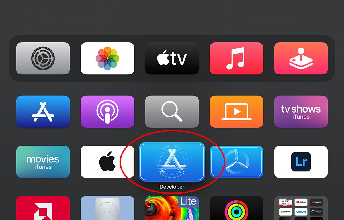
To install the Developer app for Apple TV, open the App Store app on your Apple TV and search for “Developer”. Once downloaded, run the app from Apple TV’s springboard by clicking it on your Apple TV remote:
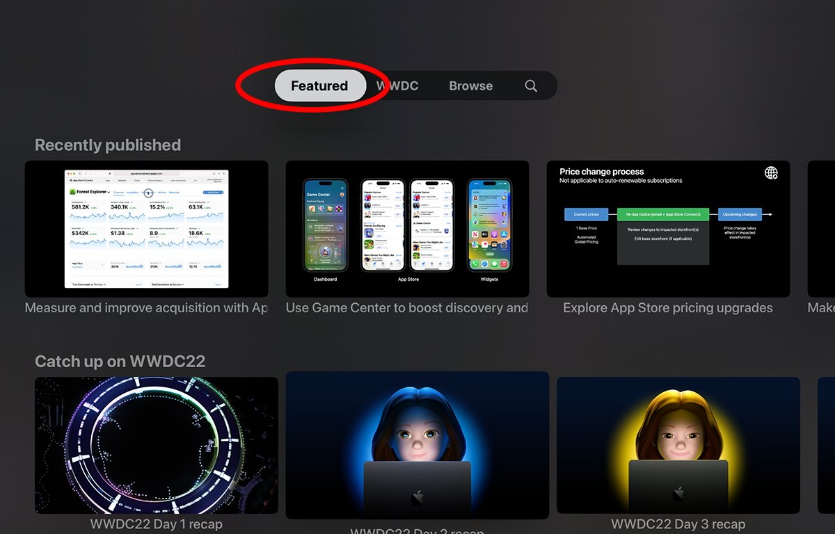
Once in the app, you’re presented with four options at the top of the screen:
- Featured
- WWDC
- Browse
- Search
Clicking Featured displays thumbnails with recently published Apple content, as well as videos and supplementary material from last year’s WWDC.
Swipe to a thumbnail and press the Remote button to view the selected presentation. To flick through the thumbnails, swipe on the remote’s surface with your thumb or finger to scroll the content.
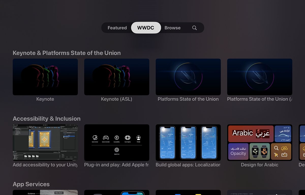
Clicking WWDC displays a grid of thumbnails for videos from last year’s WWDC – but when this year’s conference begins on June 5th, the old content will be replaced with this year’s sessions and content.
Just as with the iOS and macOS versions of the app content under WWDC is sorted by topic.
Browsing and search
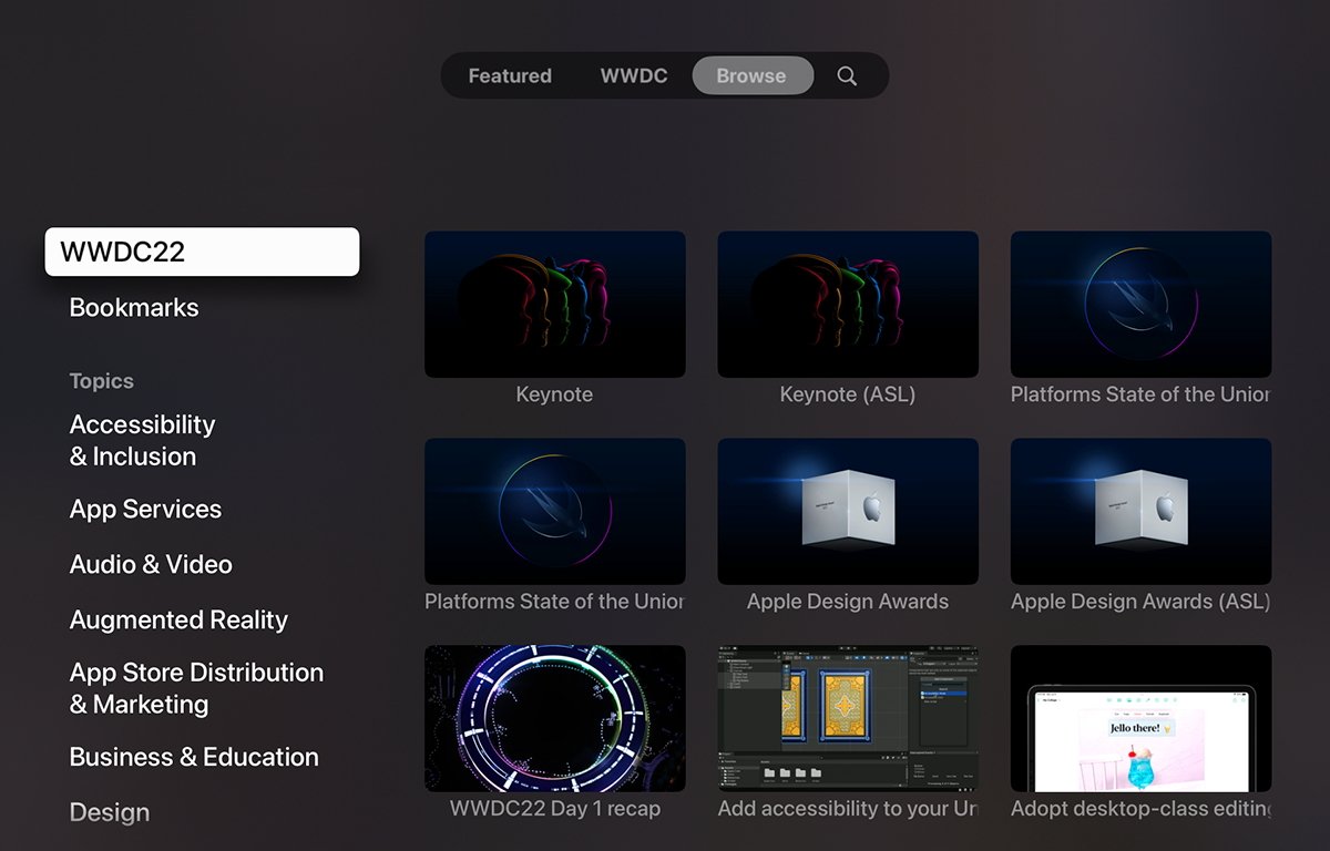
Clicking the Browse tab displays a scrolling sidebar on the left, which is similar to the iOS and macOS versions of the app, except that there are only three sections:
- WWDC22 and Bookmarks at the top
- Topics, which also organizes programming sessions by category
- Events, which displays Tech Talks, WWDC sessions from previous years, and Developer Insights.
Scroll to and click the Apple TV remote on an item in the sidebar to view its contents on the right. If you scroll to and select the Bookmarks item, the right side of the display shows all videos you’ve previously bookmarked to watch later.
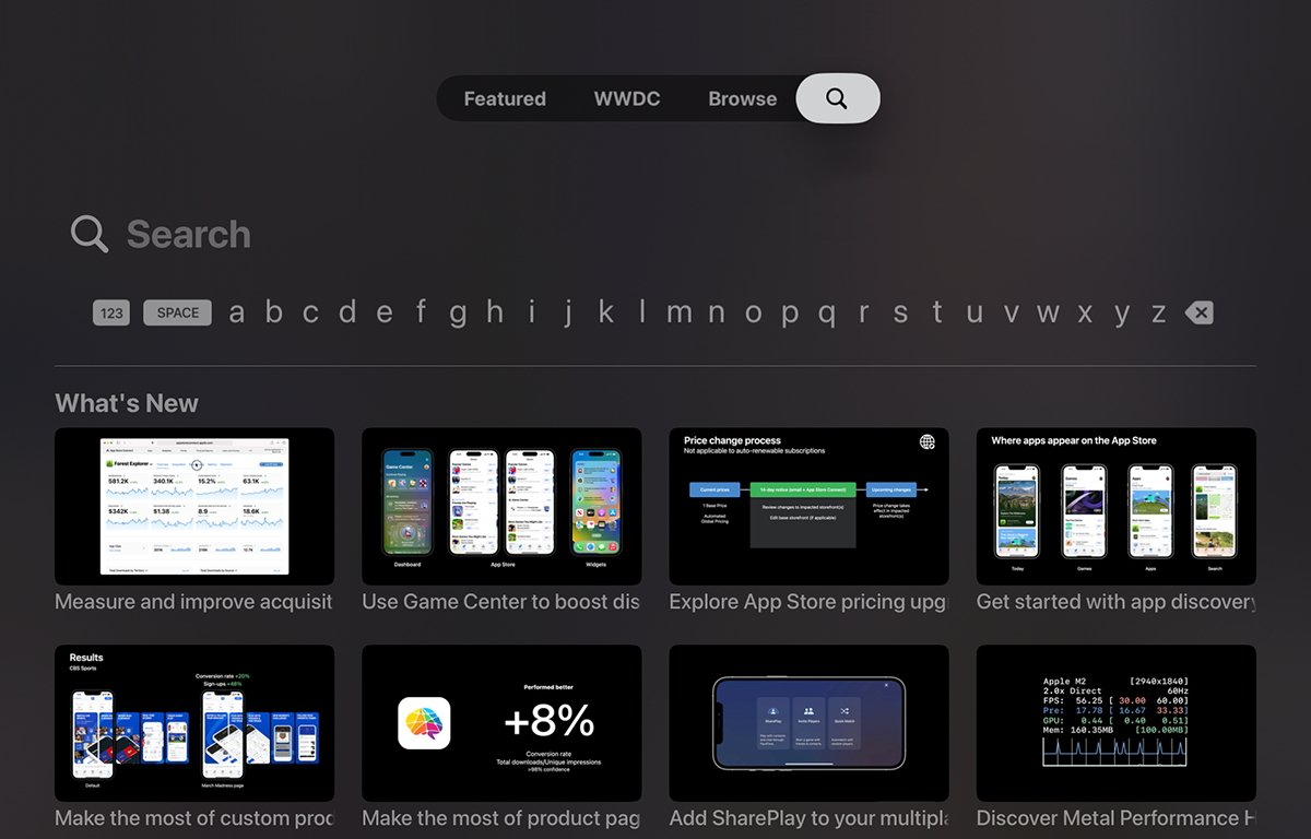
If you click the Search icon tab at the top of the screen, you’re presented with the standard Apple TV alphanumeric interface. Flick your finger or thumb on the remote to select letters one at a time as you click the remote to select them.
As you type words into Search, the app filters out all videos not matching that title. Once your search string is complete, you’ll be left only with content whose titles match your search.
Swipe down on the remote to scroll the match list, then click the remote on an item to start its content.
Adding bookmarks
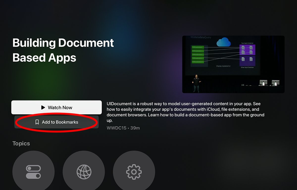
From within any single video, you can swipe down and click on the Add to Bookmarks button to add the current video to the Bookmarks list. The next time you visit the Bookmarks item in the sidebar, all videos that have been bookmarked will be listed there.
Bookmarks will also be listed with a blue bookmark icon throughout the app for any content that has been previously bookmarked.
At the bottom of each video’s window are large round circles that indicate which Apple topics this video is categorized under. You don’t need to click these or add anything to them, as the topics and each video within them are predefined by Apple.
In some ways, the tvOS version of Developer seems smoother and easier to navigate than the iOS or macOS version. The only major glaring downside is that the larger icons and thumbnails mean there’s more scrolling to reach the content you’re looking for.
But this is a tradeoff: you may have to scroll more, but the larger thumbnails also make it easier to identify content more quickly as you scroll through the lists.
If you don’t attend WWDC, the Developer app is a must – and if you do it’s still an invaluable tool for searching all content related to each development topic dating back a decade.
This story originally appeared on Appleinsider


