Arc, a Mac-only internet browser from the aptly-named Browser Company, is one of those apps trying to reimagine a core computing tool. Years after we all decided that a stack of tabs at the top of a browser window is how we’re doing things, Arc has a different approach. Like most modern apps, Arc puts everything in a sidebar and lets you build spaces that you can use to focus on a particular task. For example, all the research and documents I need for a particular article live in their own space, and I can jump over to another for personal tabs or a third for keeping an eye on the news of the day.
Arc, which launched a little over a year ago, certainly has its quirks. A big one is the fact it doesn’t have a bookmarking system like other browsers, and there are a lot of small things that differentiate it from Chrome and Safari. One of those features is taking center stage in a new update that Arc is rolling out today. It’s called Boosts, which the Arc team grandly refers to as a way to take control over the sites they visit. I’ve been testing the Boosts 2.0 release for a few weeks, and while I don’t think it is reinventing the internet, it does open up some fun possibilities.
Boosts first launched about a year ago, and product designer Nate Parrott told me the concept was to “make it 10 times easier” to build a browser extension. “If you’re the kind of person who likes to tinker with things or a person who makes websites, you probably have all the technical skills to make a Chrome extension, like JavaScript and CSS and HTML,” Parrott said, “and yet nobody makes them because it’s just really hard.” And while the original Boosts release put a bunch of tools right in the browser to let you customize sites, it still wasn’t exactly user-friendly for people who don’t know things like CSS.
“Ten times easier than making a Chrome extension is not really that easy,” Parrott said. “You have to know how to code, you have to be willing to dig around in the web inspector and figure out what things are called in the code and stuff like that. It’s just not that easy.” Boosts 2.0 fixes that in a pretty major way by giving anyone a few simple tools to tweak sites they visit. If the original Boosts made things ten times easier, Parrott wanted Boosts 2.0 to make it 50 times easier.
To that end, Boosts now has a handful of simple but useful ways to customize basically any site. There’s a color picker that lets you change most sites from the standard white or black backgrounds you’re used to, and you can also replace the font in many cases as well. That might not sound like that big a deal, but it can really make things feel fresh – being able to change the Spotify web app from the black-and-green motif was nice, and being able to try some new customization features for my Gmail inbox was fun as well.
Perhaps more useful is the “Zap” feature. This lets you highlight an element of a page that you don’t want to see and just… zap it into oblivion. I tried this with YouTube Music; since the service added podcasts a few weeks ago, the “explore” page has included a “top shows” segment that surfaces some extremely low-quality garbage. I just clicked the zap button, highlighted the section and now I don’t have to think about it anymore.
Results can be a bit hit or miss. For example, I tried to zap some elements on Twitter’s website to essentially make it read-only so I can use it to dig for news without being tempted to actually engage with anything. I was able to delete the row that contains the reply and like buttons below a tweet, but getting that to apply to every tweet didn’t work for me. Of course, if you have the technical knowledge to dig into a site’s code, you can still do that just like you can in Boosts 1.0 and use tools like CSS, HTML and Javascript to tweak things to your liking.
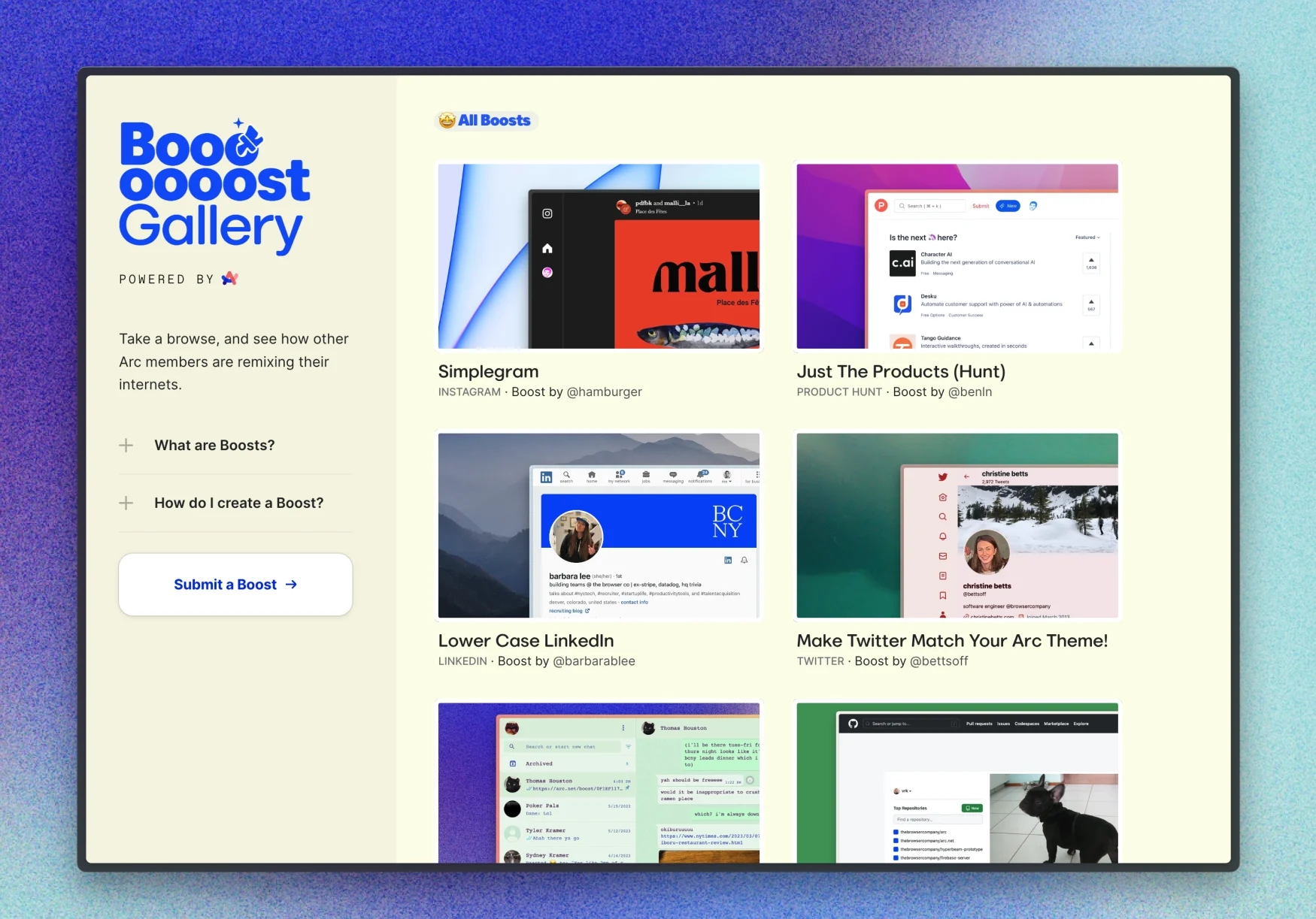
You can also share your Boosts with other Arc users, something else that’s new to this release. (Any Boost that uses Javascript is unable to be shared for security reasons, though.) If you’ve come up with a particularly inspired tweak to a site, you can share it directly with a friend, as each Boost has a permalink. Arc will also be curating a gallery of its favorite custom options as well.


The Browser Company
I asked Parrott if he had any concerns that giant corporations would take issue with users tweaking their websites, but he had the good point that Arc’s user base is so small that it’s hard to imagine it would be an issue. He also had some philosophical thoughts about the tension between how people want the internet to look versus how companies and designers want it to look. “We’ve swung so far in the direction of ‘users do not have agency over the web tools that they use,’ while the companies have so much control,” he said. “I think that really anything that swings the pendulum a little bit in the other direction of ‘the users actually have a little bit of agency over this’ I think is gonna be a positive thing and a healthy thing.”
Right now, Arc is still Mac-only and you need to sign up on a waitlist to get access, so whatever weird things people try with Boosts 2.0 will remain a minor part of the internet landscape for now. And after playing around with them a bit, I can’t say they’d be a key driver in my decision to use Arc over another browser – but then again, I’m not much of a tweaker. Maybe the people who prefer Android over an iPhone, or those who are spending hours making wild contraptions in The Legend of Zelda: Tears of the Kingdom are exactly the kind of people who might enjoy painting Engadget’s home page in a lovely shade of teal.


This story originally appeared on Engadget

