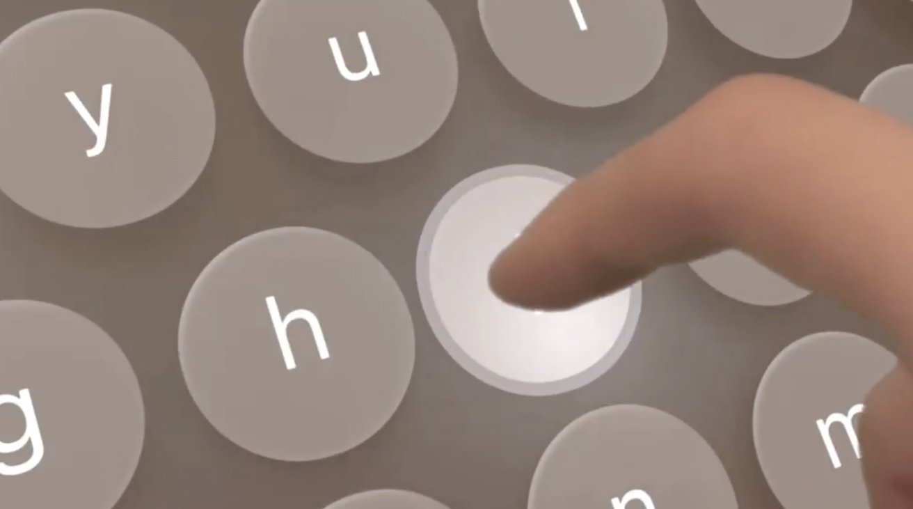
Apple’s virtual keyboard in visionOS has a high level of attention to detail, with many small elements combining to make a great UI interaction for a non-physical peripheral.
One of the problems with new platforms is a need to come up with ways for users to directly interact with them. One of these problem areas has been the keyboard, with device producers needing to come up with a way to enable keyboard-like interfaces while working within the limitations of the platform.
For VR headsets or AR applications, a keyboard can be hard to implement, since a user typically cannot see the real-world physical version. Software keyboards in virtual space are also hamstrung by a lack of tactile feedback from pressing non-existent buttons, along with the typical use of controllers to do each of the presses.
The Apple Vision Pro, with its mixed-reality display, manages to offer an excellent concept for a keyboard, and one that relies a lot on the hand detection system. Sure, Siri could be used for text entry, but the keyboard is also there as an option.
Developer Atilla Taskiran took to Twitter on Sunday to outline how Apple’s software keyboard has great “attention to details.” Breaking down the keyboard and showing with an animated gif, Taskiran offers three graphical elements that each keystroke uses.
Attention to details is crucial, especially when it comes to interactions.
Here’s a little breakdown of the keyboard interaction and visual feedback in visionOS.
1. Look at how the keys get highlighted when hovering with the fingers over them.
2. Pressing a key pushes it pic.twitter.com/07Yy81swCg— Atilla Takran (@_atilla1) June 11, 2023
First, the keys highlight as the user’s fingers over over them, and also get brighter the closer to the key the fingertip gets. This helps confirm to the user that they’re in the right area to actually type the correct key.
When pressing the key, the button doesn’t remain static, as it instead goes downwards on the Z axis to match the press. This is somewhat reminiscent of a physical keyboard’s keycaps moving up and down, albeit without the tactile feedback.
Apple adds a third UI element to the keyboard, in the form of an extended circular pulse that extends out from the key. The pulse is a way to confirm the user’s “pressed” the key far enough to be registered.
Taskiran’s tweet is only one example from an entire operating system and interface for a platform that’s relatively new to Apple. It is likely that, as more developers and outsiders of the company get to try out the Apple Vision Pro, more details of small but important elements will come to light.
This story originally appeared on Appleinsider

