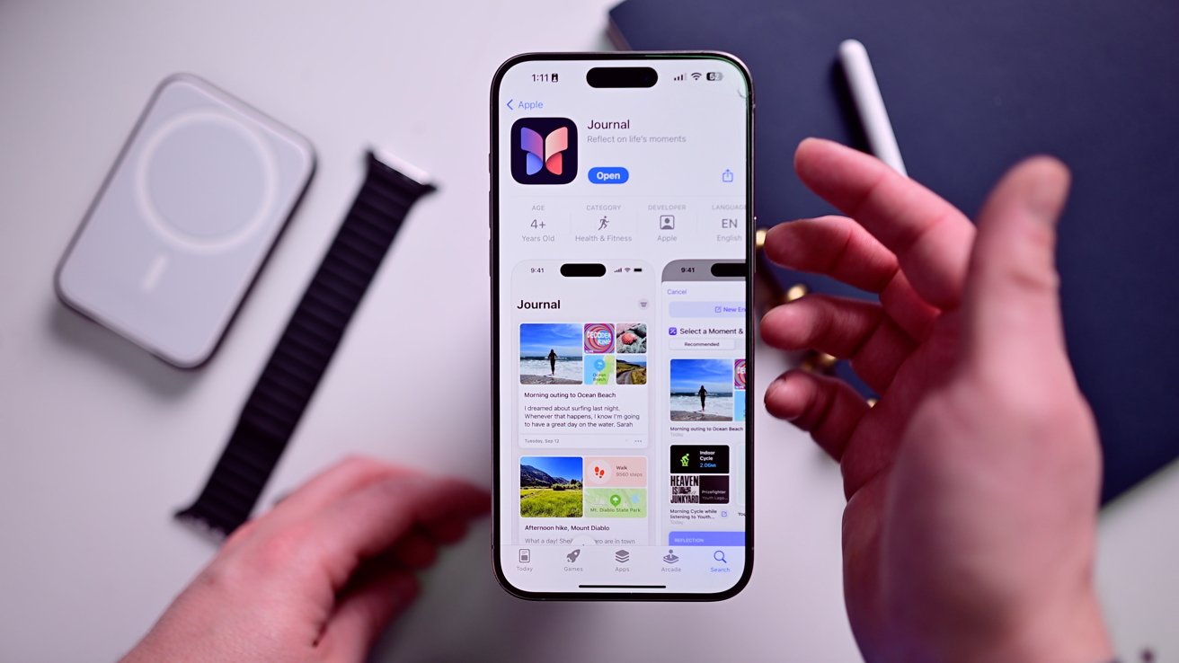
We finally got our first look at Apple’s new Journal app, so we installed it on our iPhone to test it out. Here are our first impressions of this early build.
As it stands, the Journal app is fairly basic, omitting many features found in third-party journaling apps. That said, Apple’s approach is clean, minimalistic, and a good jumping-off point for the iPhone maker.
The Journal app is only available to those running the iOS 17.2 beta. It will become widely available with the launch of iOS 17.2, which should occur sometime in December.
First launch of the Journal app
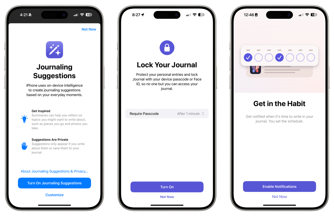
When launching the Journal app for the first time, Apple does its best to instill privacy best practices, such as locking the app when closed and how suggestions are all created and stored locally in the app.
It also asks you to enable notifications. These notifications can be tailored to your usage, creating a schedule that makes sense for you.
The app is empty on first use, gently nudging you towards the round + button at the bottom.
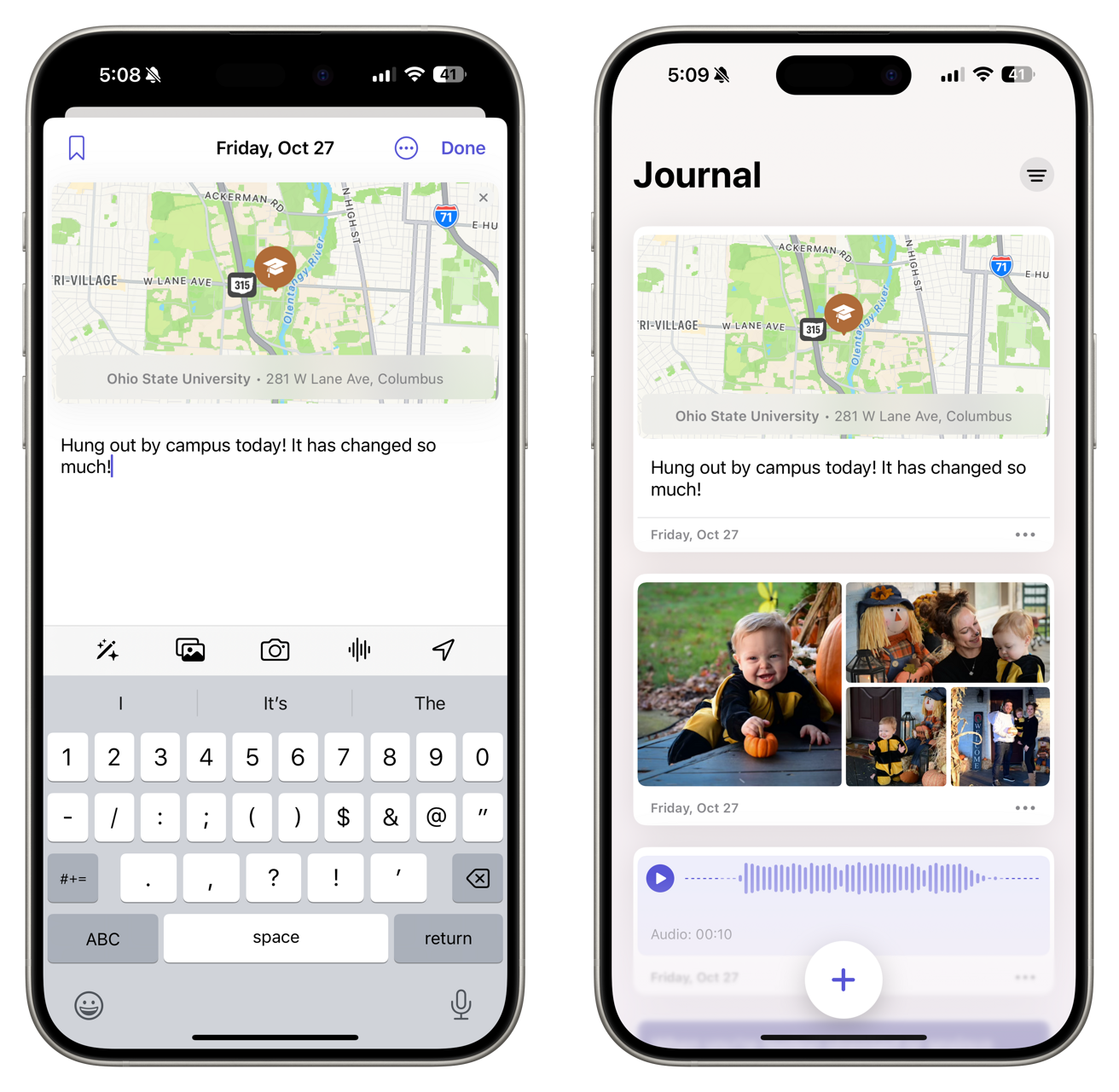
When creating a new post, you can choose from the suggestions or start with an empty entry. Apple lets you add photos, shoot directly from the camera, and add an audio snippet or a location to your entry.
The suggestions can be returned while creating a post by tapping the magic wand button above the keyboard. If you’re looking for more ideas, a refresh button on each prompt will swap it for something new.
Prompts include reflections, things that inspire you, revisiting recent decisions, and more.
Finally, posts allow you to change the entry date and add bookmarks.
Viewing the Journal app
The Journal app has a clean interface when viewing your entries, sorted by date. When available, they’ll embed media like maps, photos, and audio.
You can interact with most of these embeds on the timeline view or tap them to bring them to full screen.
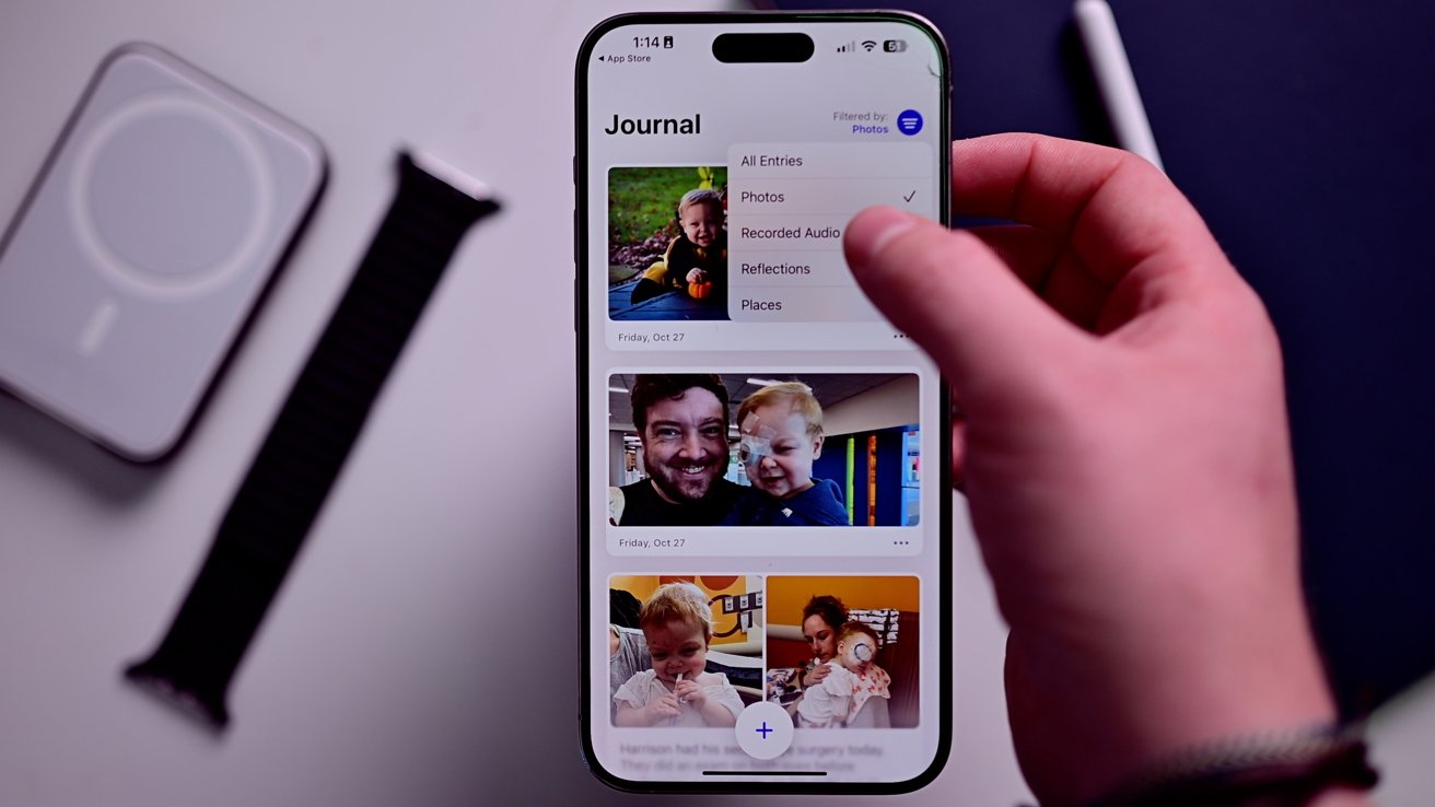
A sorting icon in the top-right corner helps you filter the entries based on content, like those with photos, audio, reflections, or places.
More to come?
As we said, this app seems fairly basic for the time being. Apple could have seemingly done much more.
So far, we see no integration or prompts based on people you’ve hung out with. There is no tie-in to the Fitness app or Health app. Apple didn’t even include a search function yet.
Third-party apps like Day One have many more features than what Apple currently offers, though we assume that will change over time. Once the suggestion API becomes active, the app will automatically populate with more entry suggestions and embeddable data.
Users can try out the new Journal app right now if their iPhone is running iOS 17.2, currently in developer beta testing.
This story originally appeared on Appleinsider

