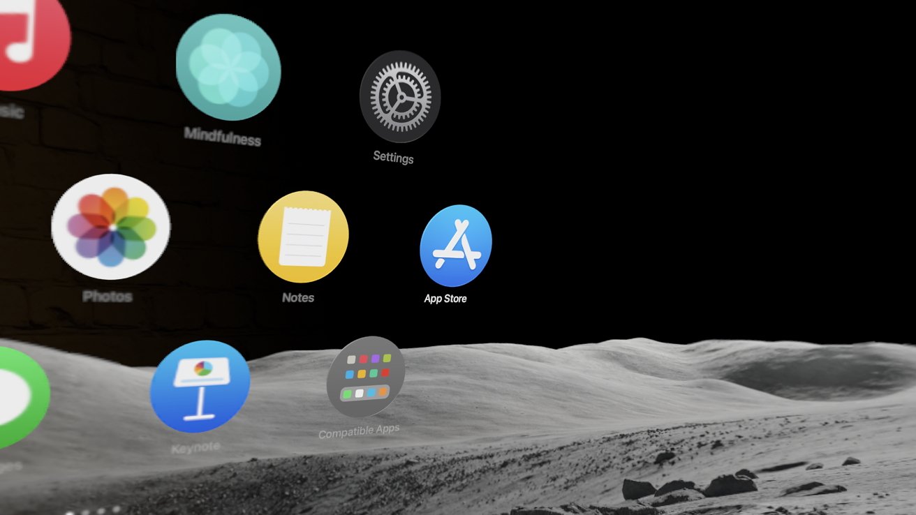
Living with Apple Vision Pro for the past month has changed everything and nothing. It is a new computing paradigm stuck doing the same things the old one did with a new coat of paint.
It’s early days for Apple Vision Pro, but the fog of excitement has begun to lift. It is a win for Apple in a lot of ways, but look beyond the flashy technology, and you’ll find it’s just an iPad you strap to your face.
In case you need a refresher, Apple Vision Pro is expensive, heavy, socially awkward, and still has a long way to go for ubiquitous app support. However, don’t let this dreary start get you down. It is still the coolest piece of technology I’ve ever used.
One month later, I continued to be impressed when I put the headset on for the first time that day. When I’m not wearing it, I think about the next time I will get to put it on, check for app updates, and scroll my purchased list just in case a new app appears.
Since getting Apple Vision Pro, I’ve used it as my primary work device. It has fully replaced my iPad at home, and the 14-inch MacBook Pro sits on a bookshelf in case I need to loop it into my workflow.
This one-month check-in will focus on using Apple Vision Pro, the app ecosystem, and migrating workflows to the device. A limited spec overview is available at the end of this write-up, but for more details about the hardware and setup, please refer to the early review.
Loving something can sometimes mean being its biggest critic. Let’s dive into what’s good and, more importantly, what needs to be addressed by updates and developers.
Apple Vision Pro review — a month of spatial computing
It’s not easy figuring out exactly how many hours I’ve lived with Apple Vision Pro attached to my face, but it’s pushing 150 hours or more. I’ve worked full shifts wearing Apple Vision Pro, with breaks, and used it for entertainment like movies and video games.
I’ve carefully observed my body, eyes, skin, and mental health during this time. To sum it up, I have yet to encounter any adverse reactions from using Apple Vision Pro regularly — at least no more than I’d expect from staring at my iPad or MacBook.
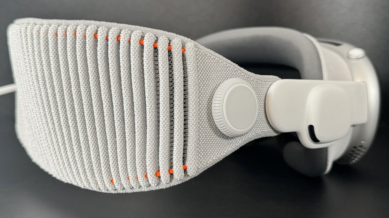
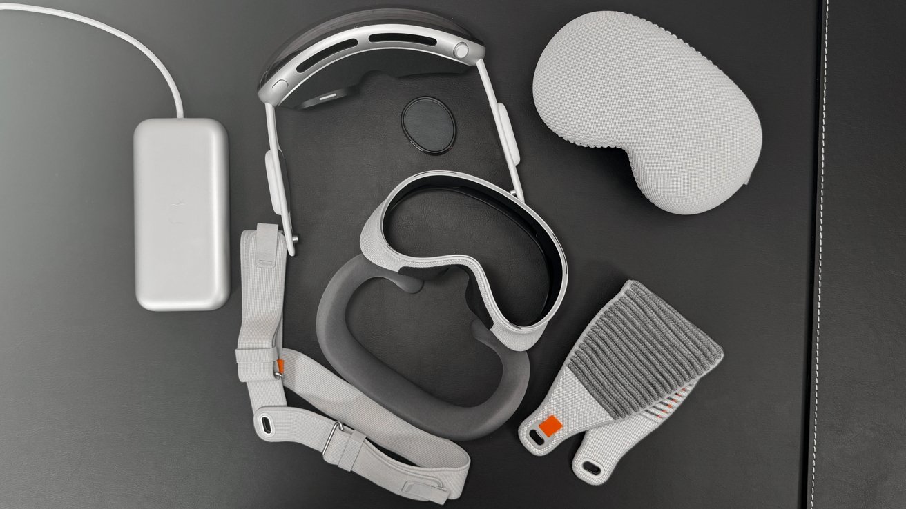
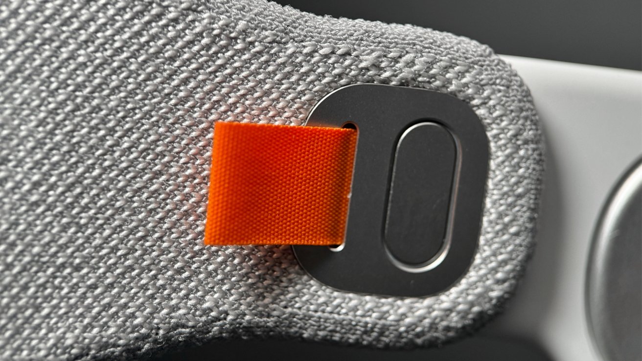
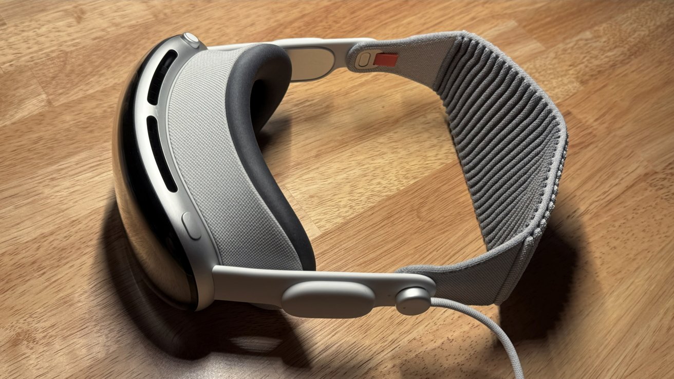
I’ve stuck with the Solo Knit band and W+ cushion. It’s a combination that feels the most comfortable to me.
Your mileage will absolutely vary.
Cable management
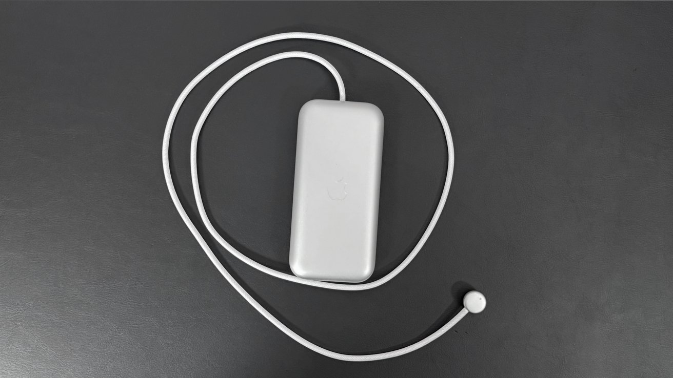
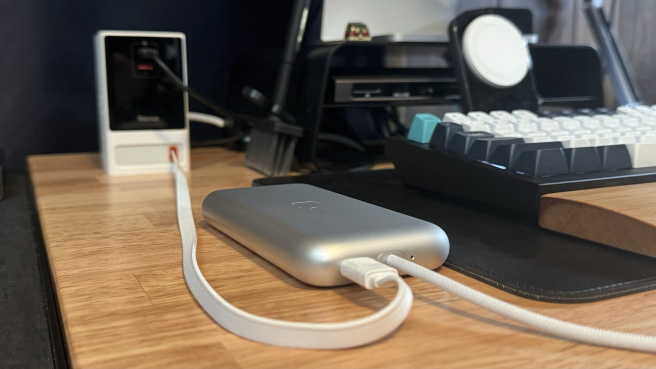
The battery has been a nonissue. I have it attached to a retractable USB-C cable on my desk when I’m sitting down, and the battery rarely discharges more than half if I get up to walk around.
Managing the cable for the battery, however, feels like a full-time job. The best place to keep it is dangling directly in front of you down your chest, which goes against every instinct.
If you’re like me, you immediately try running the cable down the back of your shirt or jacket. The problem is that you inevitably pin it to the chair you’re sitting in and can’t turn your head without pulling the cable free.
Accessories for Apple Vision Pro will likely help mitigate some of these early growing pains. There’s a novel solution waiting to be introduced, but we don’t have it yet. Until then, the battery just has to sit on the desk surrounded by its cables.
It’s an inelegant solution for Apple, but I wouldn’t have it any other way. Given the already weighty headset, it was the best solution, and the old Apple would likely not have made that necessary call.
I stand by what I said before — Apple Vision Pro in its current form is the best Apple could build today at this price point. The hardware has no equal on the consumer market, no matter what an edgy CEO might say.
Waiting on accessory support
There isn’t much of an accessory story, as popular manufacturers have only just begun announcing compatible products. One thing is certain — maybe hold off on Apple’s Travel Case.
I’m still very happy with the optical inserts provided by Zeiss. I’m not sure what kind of coating they have, but they stay pristine even after hours of use.
A quick search online will reveal a lot of third-party accessories built for Meta Quest rebranded for Apple Vision Pro. There are some bespoke cases and bands, but they are few and far between.
Etsy is already filled with stand concepts that might work, but it isn’t clear how the face cushion will age if it’s holding the weight of the Vision Pro against gravity all day. I’m hopeful for something more novel, similar to Apple’s fancy tray at the Apple Store, but I may be better off buying a valet tray than some overpriced piece of wood.
The light seal, cushion, and straps all attach through obvious mechanisms that third parties can replicate. The question is when, not if, we’ll see non-Apple components on the market.
Apple Vision Pro review — a truly 1.0 operating system
Apple has not released visionOS 1.1 as of this publication. It will undoubtedly provide fixes and improvements to what I’m discussing below, but it is still notable that some issues have persisted for the first month after launch.
Force quit
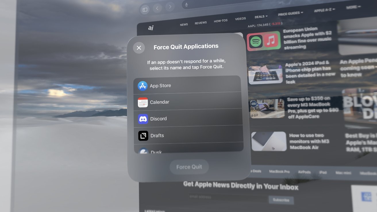
Thankfully, Apple provided a way to force quit troublesome applications. This is accomplished by pressing both buttons simultaneously for a few seconds until a menu appears.
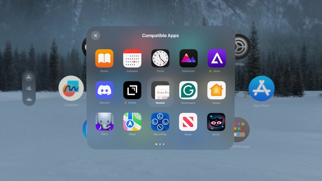
The amount of time I use Apple Vision Pro daily, combined with the number of apps I keep open, contributes to needing the force quit menu at least daily. It’s especially necessary for the compatible apps originally built for iPad.
When bugs occur, they can grind things to a halt. The worst and rarest bug is when the window rendering engine fails. It crashes some open apps and renders the other windows as a solid red block.
The only solution for some errors is to unplug Apple Vision Pro and plug it back in so it reboots. Holding the two top buttons until the shut down menu appears is also an option.
Accidental taps with no undo
The next complaint isn’t exactly a bug, but it needs to be solved with software. When typing using the home row on a keyboard, your fingers tend to get close together and can sometimes trigger a tapping action.
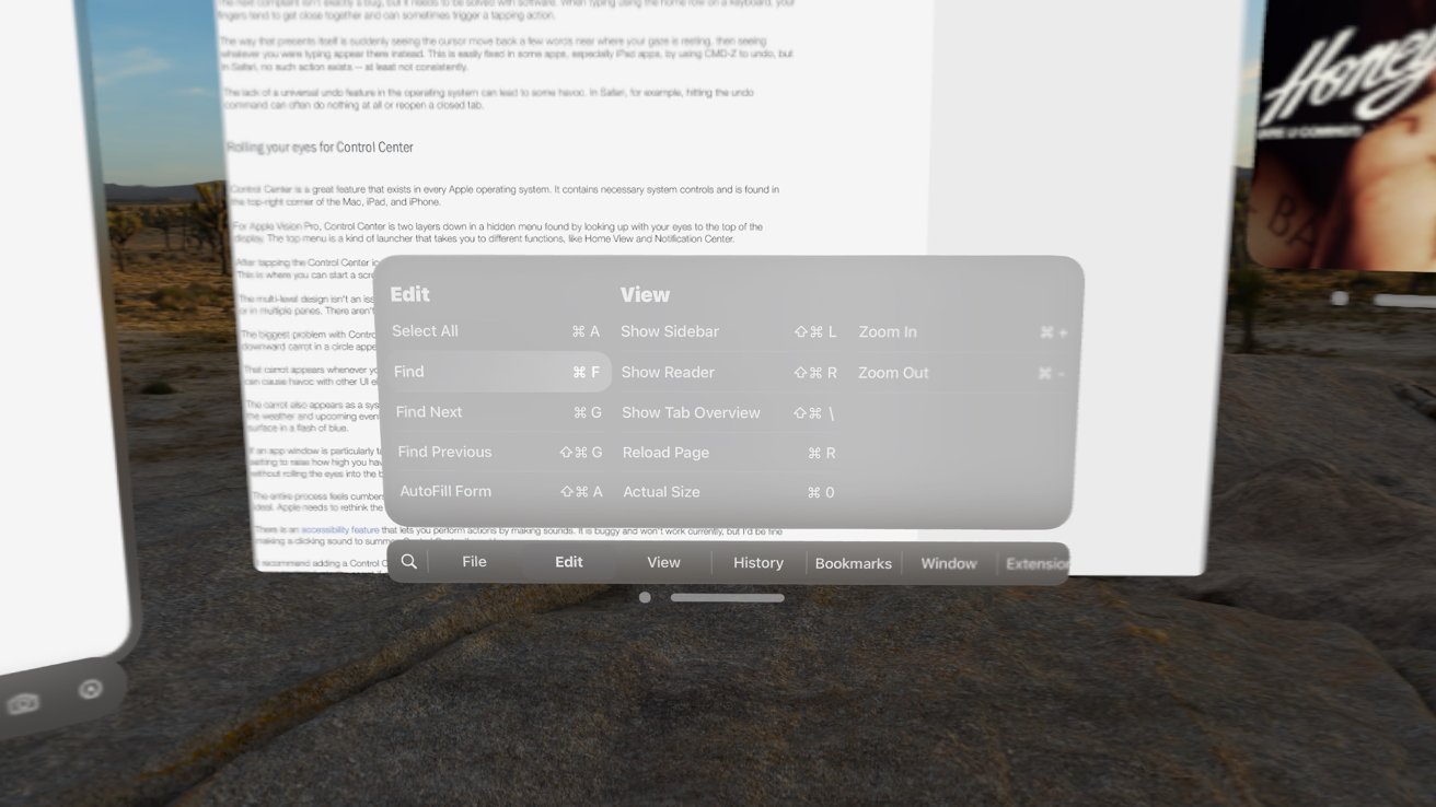
The way that presents itself is suddenly seeing the cursor move back a few words near where your gaze is resting, then seeing whatever you were typing appear there instead. This is easily fixed in some apps, especially iPad apps, by using CMD-Z to undo, but in Safari, no such action exists — at least not consistently.
The lack of a universal undo feature in the operating system can lead to some havoc. In Safari, for example, hitting the undo command can often do nothing at all or reopen a closed tab.
Rolling your eyes for Control Center
Control Center is a great feature that exists in every Apple operating system. It contains necessary system controls and is found in the top-right corner of the Mac, iPad, and iPhone.
For Apple Vision Pro, Control Center is two layers down in a hidden menu found by looking up with your eyes to the top of the display. The top menu is a kind of launcher that takes you to different functions, like Home View and Notification Center.
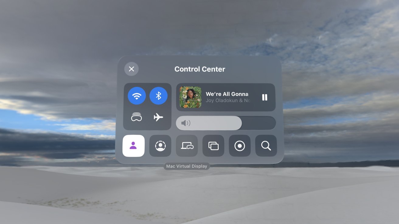
After tapping the Control Center icon, you’re met with familiar controls for media, Wi-Fi, Bluetooth, and a handful of system tools. This is where you can start a screen recording or bring a Mac into the virtual environment.
The multi-level design isn’t an issue — it just seems inelegant when there’s infinite space to show all the buttons on a bigger window or in multiple panes. There aren’t any labels on anything, but you can stare at an icon for a label to appear.
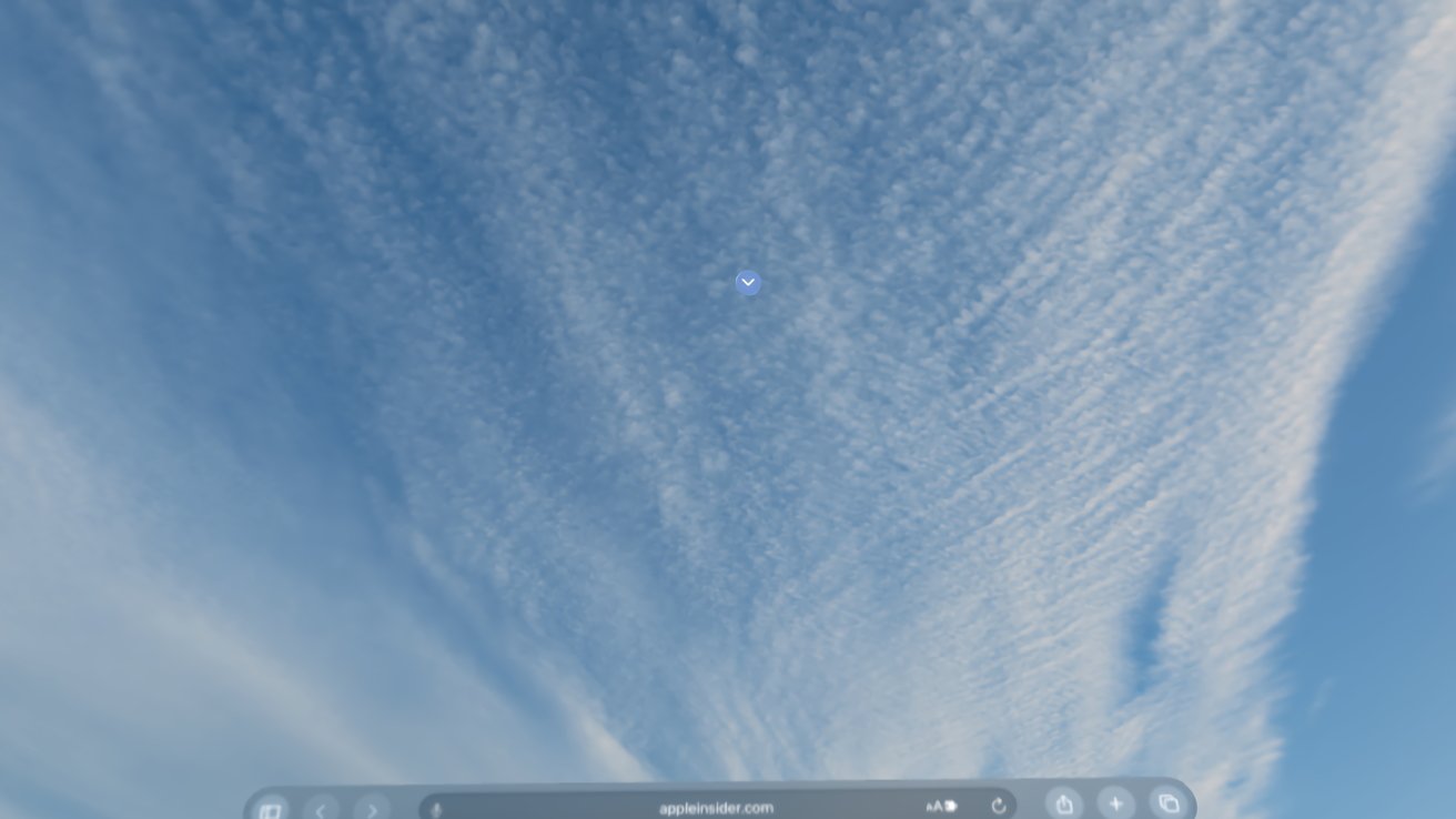
The biggest problem with Control Center is how it is summoned and its persistence throughout the operating system. A small downward carrot in a circle appears when looking up, which is tapped to open the menu.
That carrot appears whenever you look up without fail, which is great when you need Control Center. Otherwise, it’s a distraction that can cause havoc with other UI elements, especially if a window transparency bug is active.
The carrot also appears as a system warning when the microphone, camera, or location is used. I’ve been using GlanceBar to show the weather and upcoming events, and it checks the weather periodically. It pulls location data every time and causes the carrot to surface in a flash of blue.
If an app window is particularly tall and you want to glance at something higher than eye level, it can trigger the carrot, too. There is a setting to raise how high you have to look to see the Control Center carrot, but it becomes impossible to summon Control Center without rolling the eyes into the back of your head.
The entire process feels cumbersome and needs more thought. Control Center needs to be findable, but the eye-based gesture isn’t ideal. Apple needs to rethink the gesture or introduce a new one.
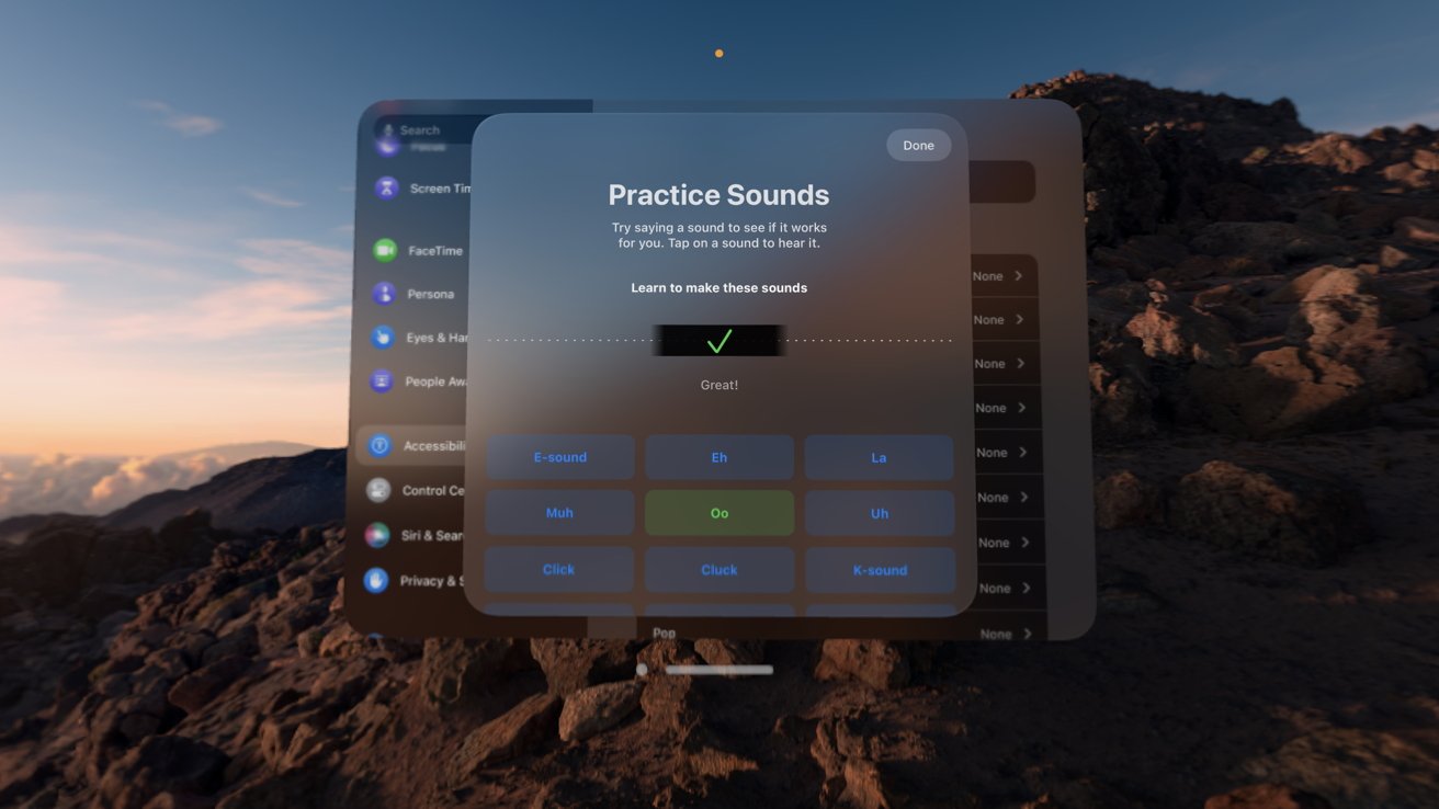
There is an accessibility feature that lets you perform actions by making sounds. It is buggy and won’t work currently, but I’d be fine making a clicking sound to summon Control Center if need be.
I recommend adding a Control Center button to the Home View. That way, it’s always a Digital Crown press away if needed, allowing users to deactivate the carrot if desired.
Of course, my issues with Control Center may be related to system bugs that can be fixed in an update. Either way, it needs to be addressed.
Apple Vision Pro review — slow software rollout
Multiple things can be true at the same time. Apple Vision Pro is an excellent piece of hardware that feels like it was pulled from the near future, visionOS is a platform that will one day run on true AR glasses, and the software story is virtually non-existent 30 days on.
Before you talk about the 1,000 native apps (as of February 13), don’t worry, I’m well aware. However, that number is meaningless if the available apps aren’t performing the functions I need.
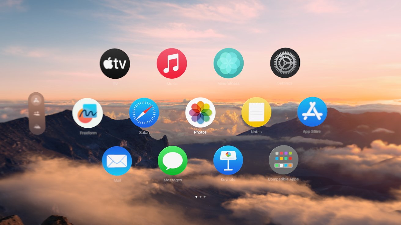
As of this writing, I have 47 native apps installed, including what Apple includes on the system. There are 40 compatible apps installed — that’s 87 total despite my Settings app reporting 61.
There are 196 apps on my iPad Pro, according to the Settings app, which likely excludes the pre-installed Apple apps. Remember, too, that those are all native iPad apps.
Don’t start sharpening your pitchforks yet — yes, I know this is a time-related problem. As more time passes, there will be more apps available.
The biggest issue is Apple hasn’t provided developers with many options beyond a subpar simulator on their Macs and in-person developer sessions. Developers outside the United States are out of luck until a broader product launch later in 2024.
I’m very surprised by the rollout so far. Many apps are available to download in compatibility mode, but developers who are usually more ambitious or quick to adopt new Apple platforms are more hesitant here.
The biggest reason I’ve been able to uncover so far is the review system. It can be very difficult to recover from a single bug causing a slew of one-star reviews.
So, the developer would rather not exist on the platform than get buried with bad reviews. Using public users to bug hunt isn’t really an option.
These aren’t easy problems to solve, but one month later, we’re still dealing with a lot of unknowns.
Apple Vision Pro review — a gaming miss so far
It should surprise no one reading this review that Apple has never quite understood gaming. With Apple Vision Pro, it’s as if Apple forgot the biggest reason people buy VR today is for gaming.
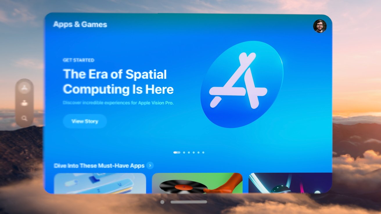
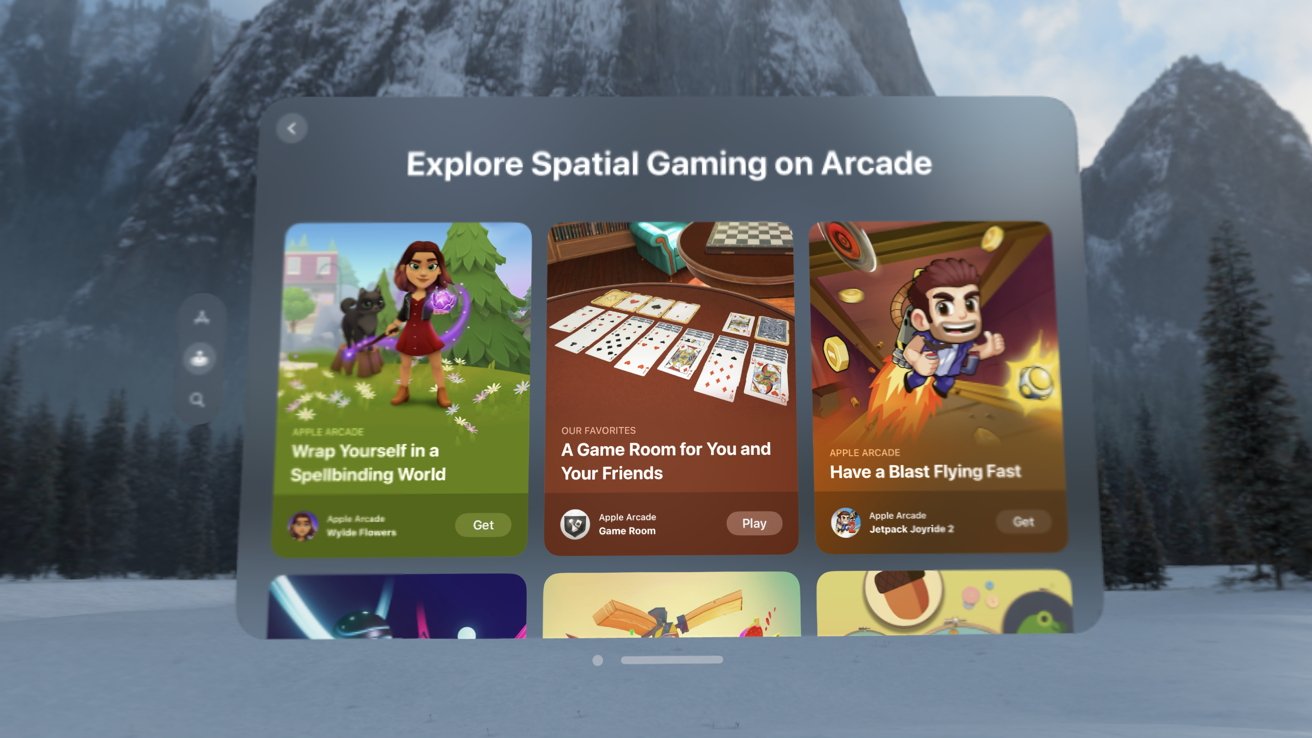
The visionOS App Store has three tabs — Apps, Arcade, and Search. So you’d think there was some equal distribution between those tabs, but not quite.
Apple had the foresight to partner with some big apps like djay and JigSpace to have exciting experiences to demo. That wasn’t the case with gaming.
Native gaming outside of Apple Arcade didn’t exist when Apple Vision Pro launched, besides a handful of simple titles. A few games have debuted in the month since, but Apple seemed to focus on getting Arcade titles out.
Over a hundred Apple Arcade games are available in compatibility mode, which is nice but, honestly, the bare minimum. There are eight spatial games in Apple Arcade, but not all of them offer full immersion.
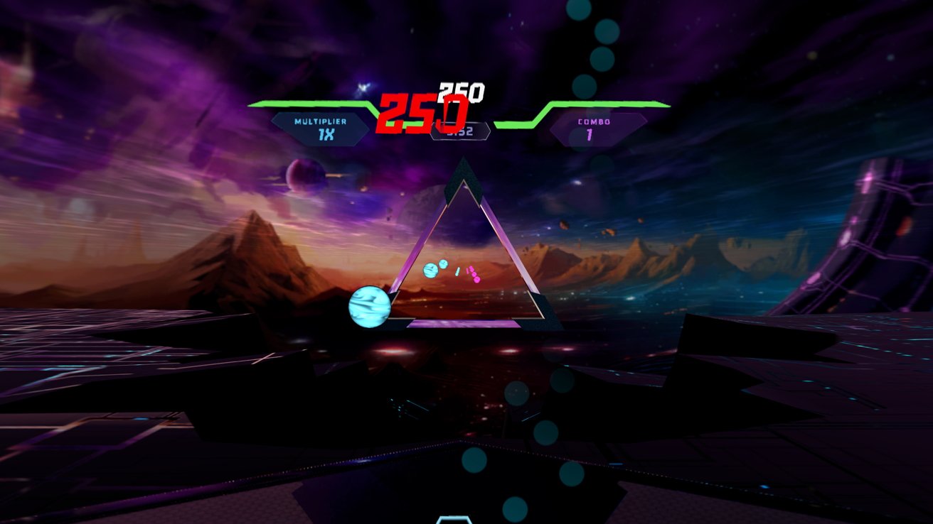
The closest game to a full 3D VR immersive experience in the App Store is Synth Riders. It’s a fine, popular game, but it can’t carry the entire app store.
Other titles are coming, like the years old but excellent Job Simulator. The iPhone is the world’s largest gaming platform, and it’s mostly ignored on the Mac. Given that Apple Vision Pro spawned more from the former than the latter, it just seems odd that Apple entered a space dominated by gaming without a gaming story.
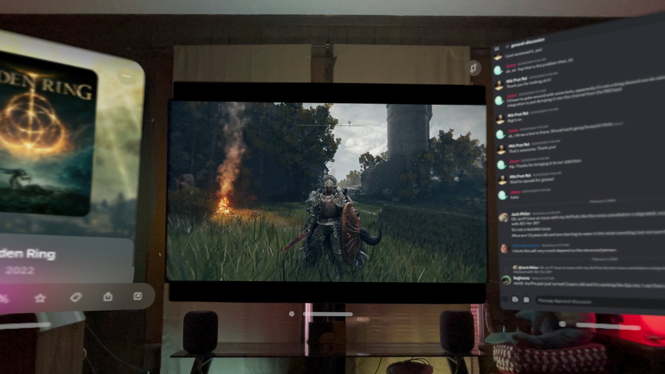
Don’t get me wrong, gaming on Apple Vision Pro is quite amazing with what is available now. Even playing existing iPad games or bringing our PlayStation 5 in via Remote Play is a great use case.
I just expect a little more shock and awe from an Apple product launch. The number of games and quality experiences will increase with time, but Apple can’t take a back seat — it needs to evangelize and convince developers to bring games to visionOS.
It also doesn’t help that there haven’t been any gaming announcements. There are no big titles from Capcom or Meta and no word on future Apple Arcade spatial titles.
Apple Vision Pro review — the new entertainment paradigm
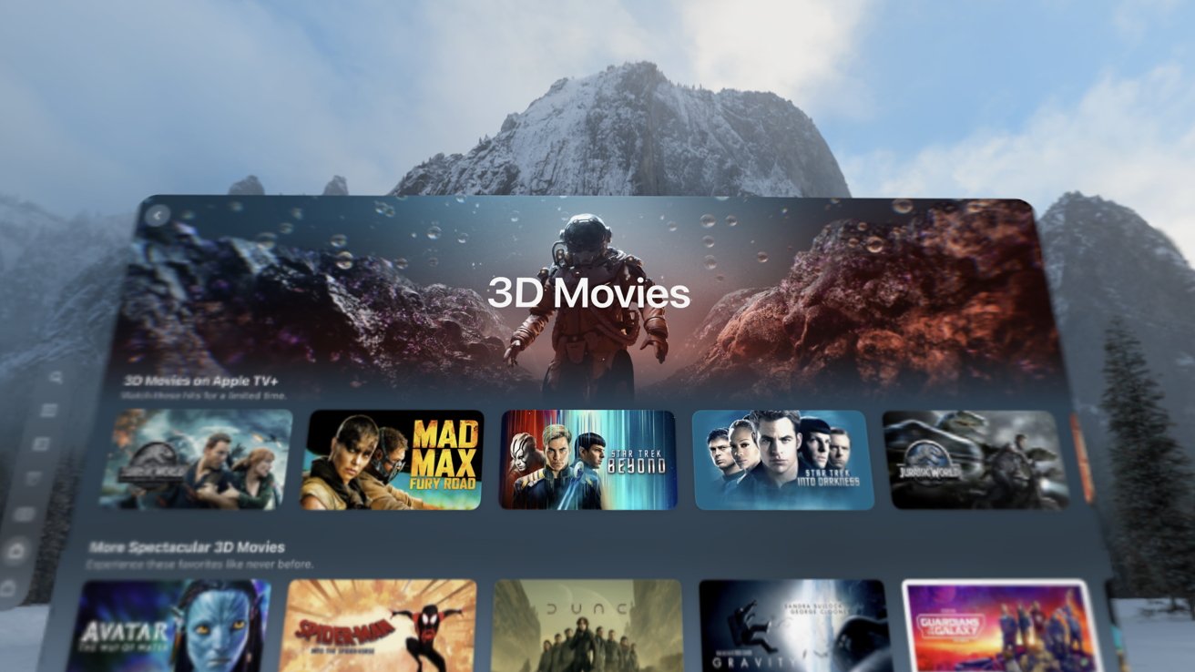
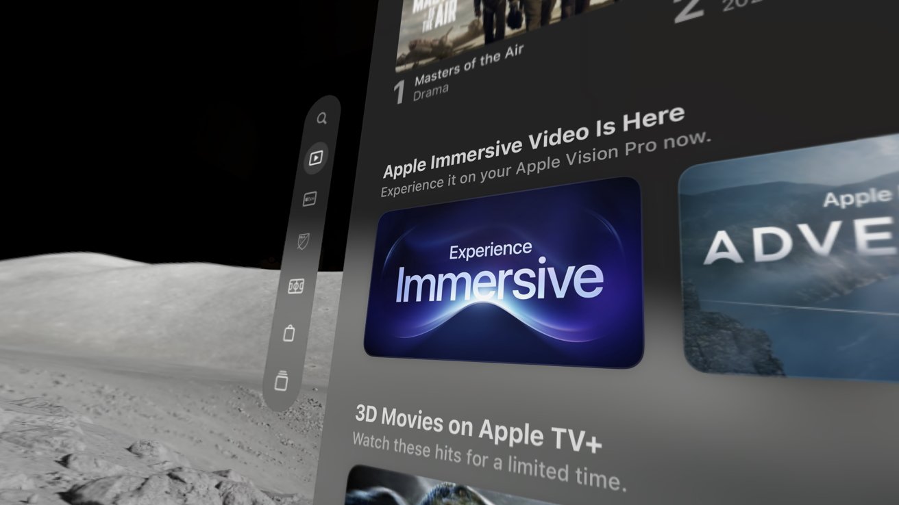
I’m not the first one to say it, but entertainment on Apple Vision Pro may be the killer app everyone is looking for. Watching 3D movies on a 150ft display hovering over a lake is incredible, but immersive video is just breathtaking.
3D is finally good
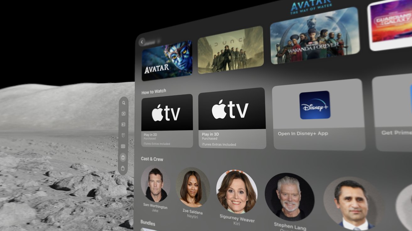
In the past month, a slow trickle of old 3D movies has appeared in my library or the Apple TV Store. My collection has grown over the past decade, and Apple luckily automatically upgraded eligible movies to 3D at no cost.
However, there is an issue where movies added via Movies Anywhere won’t get the upgrade. The only way to resolve this is to buy the movie in the Apple TV Store, but the option isn’t always available.
For example, the only way I can watch Shrek in 3D is if I purchase a video bundle containing the movie. The option to buy it by itself doesn’t exist since I already technically own it.
It’s a metadata issue, but it’s one Apple needs to resolve. Even if it means buying the movie again, at least give me the option.
Now that I’ve had time to watch movies with Apple Vision Pro, I can say it is the best way to view 3D media I’ve seen so far. I was an early adopter of 3D TVs and purchased new models through the 2010s thanks to my military income.
The movie theater and home TV experience with 3D glasses never worked as well as you’d hope. That changes with Apple Vision Pro and its independent displays per eye.
The movies play at full brightness with no flicker and no odd color issues, and you’re always at the correct viewing angle. So, despite years of disappointment as the fad came and went, I’m happy the 3D phase occurred so that all this content could exist.
“Finding Nemo” may be an older film, but the 3D is quite fun since it is mostly underwater. And the latest “Star Wars” trilogy makes great use of depth, especially in the space battle scenes.
Lack of new immersive experiences
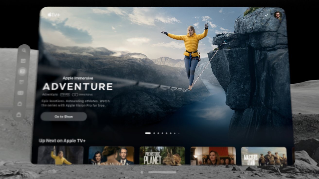
If you want to wow someone who’s never worn an Apple Vision Pro, just fire up an immersive video. Too bad there are only four of them — “Adventure,” “Wild Life,” “Prehistoric Planet,” and “Rehearsal Room.”
A sizzle reel available in the Apple TV app that was also played during the Apple Vision Pro in-store demo shows that Apple has more content planned. Apple hasn’t provided any information on the release schedule for more episodes or shows in the immersive format.
One month on, it seems that Apple would at least have released something new. The four available videos are relatively short, and all of them can be watched within an hour.
Apple records its immersive content with 8K cameras that appear with 180 degrees of view. The content is likely difficult to shoot and edit, not to mention expensive.
Other content that was developed with VR in mind is available in the App Store. However, these weren’t created with the high resolution of Apple Vision Pro in mind and don’t provide the same immersion as Apple’s video.
Like with gaming, Apple will have to evangelize or outright pay for content. Creators don’t have much incentive to build immersive videos or games for a platform with under a million users.
Audio Pods vs AirPods
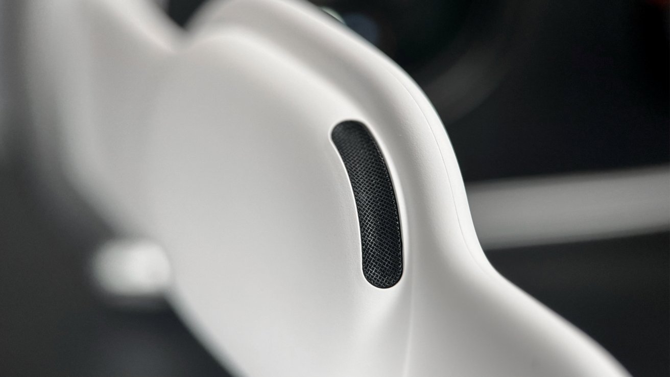
Readers of my first Apple Vision Pro review may have been left confused by my omission of mentioning Audio Pods. The reason is they’re so good at being invisible that I forgot they were there.
When using Apple Vision Pro and listening to audio of any kind, it sounds like it’s surrounding you. If you stop and think about it, yes, the audio isn’t as full as a HomePod or as bass-heavy, but it doesn’t matter.
Apple is using an algorithm to process all of the room data to create audio signatures as if the sound was entering your ears after reflecting on the surfaces of your space. This is particularly effective at making sound directional with Spatial Audio.
I’m not an audio expert, but I find the sound from the Audio Pods quite pleasant. I always play music while working and have turned off head tracking, so it isn’t directional.
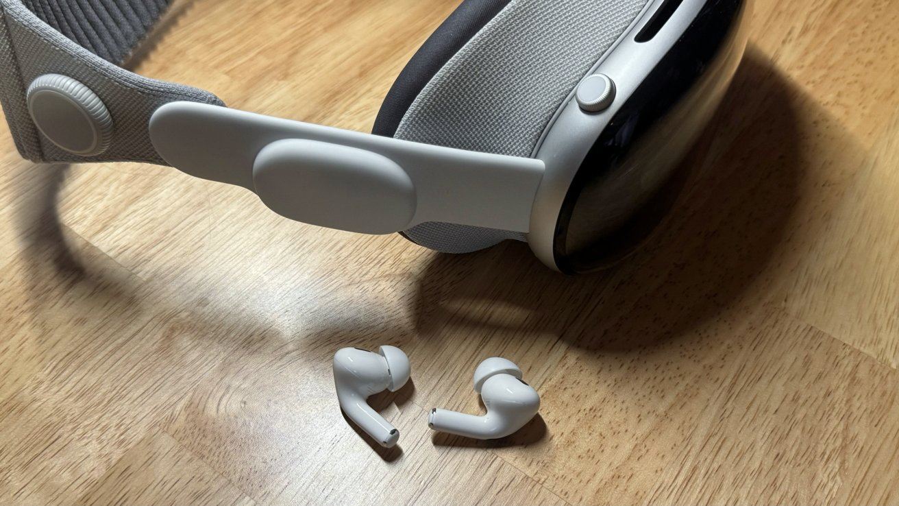
The AirPods Pro 2 with USB-C offer an improved experience thanks to better drivers and lossless audio. However, that means plugging your ears.
There’s a kind of freedom to hearing crystal clear audio that surrounds you without anything blocking your ears. That’s why I usually use Apple Vision Pro without AirPods.
However, when I’m watching video or playing a game, I’ll put in the AirPods for perfect isolation. Having a movie playing in 3D on a big theater screen with noise cancellation and perfect surround audio can’t be beat.
I benefit from working in a home office, so having audio blaring from tiny speakers beside my ears isn’t an issue. Anyone nearby can hear the audio without trying, so keep that in mind and use AirPods to be polite.
Apple Vision Pro review — evolving the office
I spend more time than most thinking about how I work. Going from iPad only to a MacBook Pro and then back to iPad has made my last few years at AppleInsider interesting.
However, nothing could prepare me for Apple Vision Pro. It has completely taken over as my work machine when I’m in the home office.
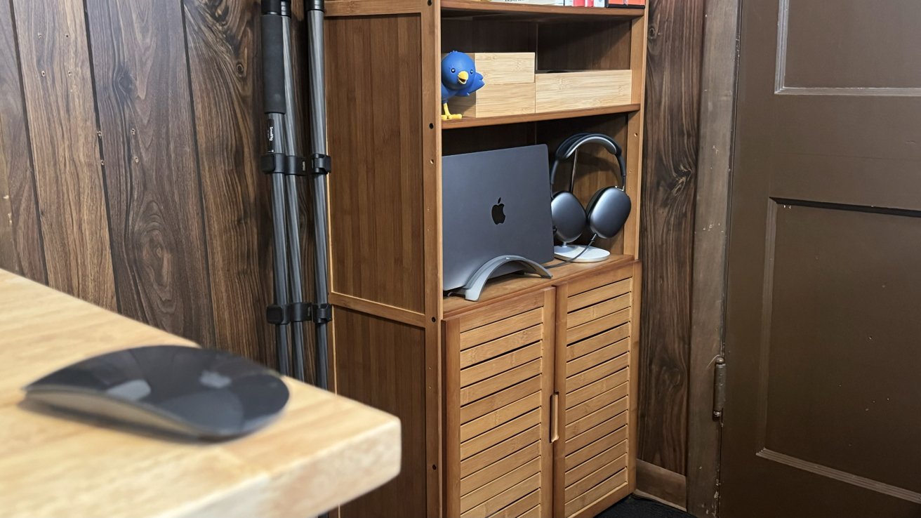
My iPad Pro with Magic Keyboard is still my go-to machine when I need a portable computer outside the office, but everything else falls to Vision Pro. The 14-inch MacBook Pro is still here, but it has been relegated to a bookshelf where it can be summoned into visionOS as needed.
Setting up the spatial computer
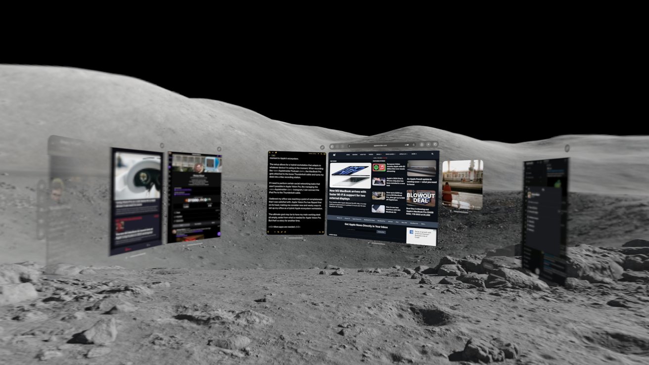
I come to work and put the headset on with an immersive environment set to about 75%. If my office was brighter or had prettier walls to look at, I’d consider going full passthrough, but the dark wood paneling isn’t ideal.
Working in immersive environments also offers a kind of whimsy that can’t be found on other platforms. I’ve enjoyed placing apps and objects all around me — even a small 3D Pokemon companion provides joy when I see it just idly animating.
Placing windows around the virtual sphere you inhabit within Apple Vision Pro provides its own level of enjoyment. I’ve taken to lining up the shadows on the ground to ensure I’ve got every window perfectly set every time.
It seems inevitable that Apple will introduce a function that will restore apps to specific sizes and positions. Everything is back to zero with each restart, boot loop, or power cycle, which can be frustrating.
Despite that, I’ve found that resetting all my app windows one by one at the start of a shift gives me a nice overview of everything. Nothing is hiding anywhere or in a weird configuration I forgot from the last session. It’s all just fresh.
A hybrid office
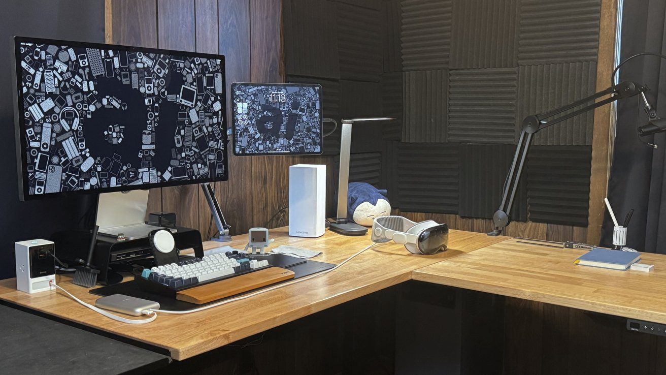
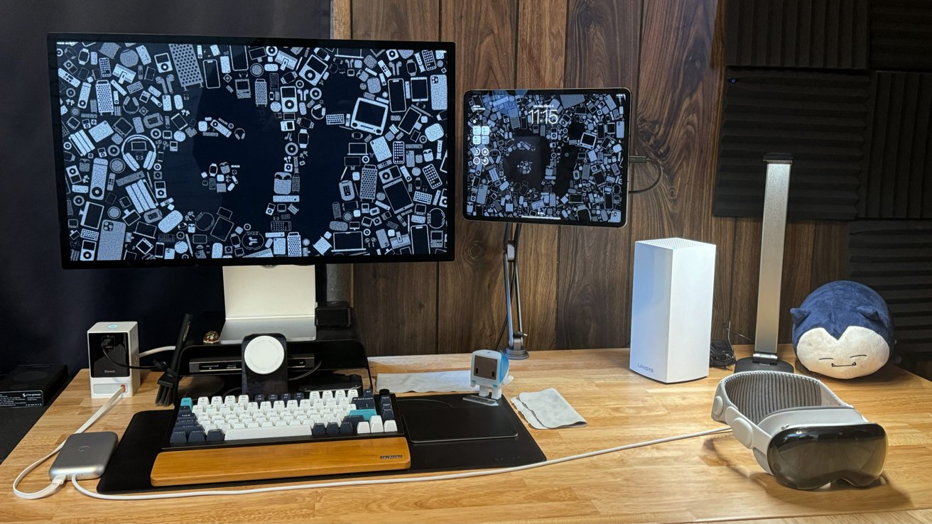
Back in the real world, my desk setup is still mostly recognizable from before Vision Pro arrived, though I’ve minimized what’s on the surface. A Thunderbolt 4 hub still connects my Studio Display, Magic Trackpad, and various accessories to a single cable I can attach to an iPad Pro or Mac, depending on my needs.
When nothing is connected to that Thunderbolt cable, the accessories still get charged with Bluetooth on standby. The Magic Trackpad automatically connects to the Apple Vision Pro, and the Keychron has a switch to activate Bluetooth.
A separate Magic Mouse on my desk lets me wake my MacBook Pro from its bookshelf nook. It is connected to a portable monitor obscured behind closed cabinet doors so that it wakes despite being in clamshell mode.
When the Mac wakes from sleep, my Apple Watch unlocks it from my position at the desk, and enables me to bring the display into Vision Pro without me ever setting eyes on the Mac display. It is yet another example of a magical moment in Apple’s ecosystem.
The setup allows for a hybrid workstation that adapts to whatever device I’m using at the moment. When recording the AppleInsider Podcast, the MacBook Pro gets attached to the loose Thunderbolt cable and turns my desk into a Mac recording station.
If I need to perform certain social networking tasks that aren’t possible in Apple Vision Pro, like managing the AppleInsider Instagram, I can connect the iPad Pro to the Thunderbolt cable.
I believed my office was reaching a point of completeness that I was satisfied with. Apple Vision Pro has flipped that on its head, making me consider new and wacky ways to set up my office as a hybrid Apple ecosystem workstation.
The ultimate goal may be to have my main working desk sit empty, aside from what is needed for Apple Vision Pro. But that’s a story for another time.
More apps are needed
As mentioned, I can complete most of my work tasks within Apple Vision Pro, but workarounds are in place. For example, I have to post to Threads through Safari instead of an app, and managing Instagram is completely locked to my iPad.
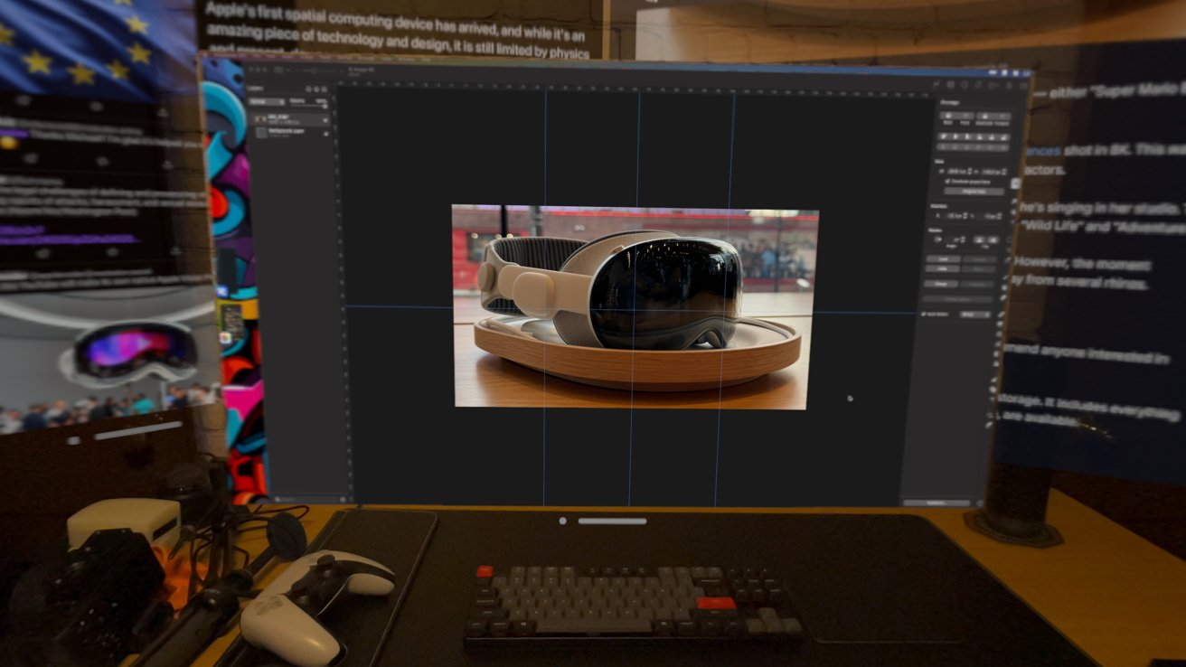
If I need to create a graphic for an article beyond resizing an image, my Mac comes to the rescue with Pixelmator Pro. My go-to apps for building multi-layer images on iPad are made by Affinity and aren’t on Apple Vision Pro yet in any form.
Thankfully, Photomator is on Apple Vision Pro, which allows most of my image work to be performed without ever waking the Mac. A multi-layer graphics application will come to the platform eventually and eliminate another need for my Mac escape hatch.
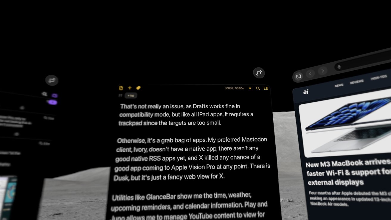
I don’t have a native writing tool for Apple Vision Pro yet. This review and everything else I write for work are done in the iPad version of the Drafts app, and it may be some time before it is updated to be native for visionOS.
That’s not really an issue, as Drafts works fine in compatibility mode, but like all iPad apps, it requires a trackpad since the targets are too small.
Otherwise, it’s a grab bag of apps. My preferred Mastodon client, Ivory, doesn’t have a native app, there aren’t any good native RSS apps yet, and X killed any chance of a good app coming to Apple Vision Pro at any point. There is Dusk, but it’s just a fancy web view for X.
Utilities like GlanceBar show me the time, weather, upcoming reminders, and calendar information. Play and Juno allows me to manage YouTube content to view for information purposes.
It is a good initial run of apps, and I realize it has only been a month. I’m excited to see what developers build for visionOS once new ideas start to bubble up and existing apps get the native treatment.
Apple Vision Pro review — spec and design recap
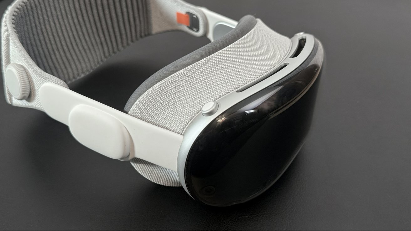
In case you’ve been sleeping under a rock or haven’t read my first review, here’s a quick overview of the Apple Vision Pro hardware. It’s a large set of what looks like ski goggles that’s basically a 12.9-inch iPad Pro you strap to your face.
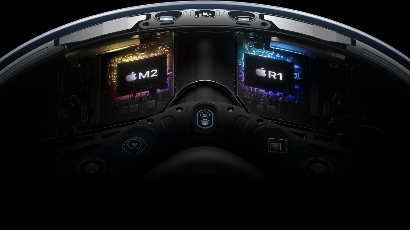
The front glass cover acts as a lens for the array of cameras and sensors capturing data from the real world. This is passed through an R1 processor that recreates a 3D passthrough model of your space with 12 milliseconds of latency while capturing eye
Apple Vision Pro runs the M2 processor with an 8-core CPU, a 10-core GPU, 16GB of RAM, and a 16-core Neural s. That’s the equivalent of the base Mac mini, so compatible iPad apps and native visionOS apps shouldn’t be a problem.
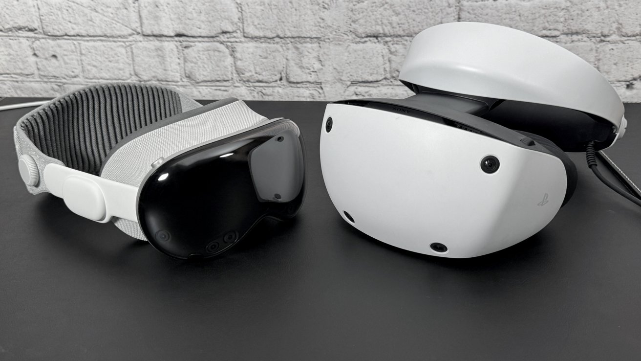
It weighs between 21.2 and 22.9 ounces, depending on the paired accessories. Compare that to the PSVR 2, which weighs 19.8 ounces without the cable attached.
The battery weighs 12.45 ounces, which is twice the weight of an iPhone 15 Pro. It is rated at 3166 mAh capacity with 35.9 Wh for about 2 hours of use.
Each display has about 3,380 pixels per inch, which Apple claims is equivalent to a 4K TV per eye. That’s not quite true, but close at 3,660 pixels by 3,200 pixels.
Foveated rendering allows everything the user looks at to be shown at full resolution while keeping everything else de-rezzed. Rendering everything at 100% resolution all the time would be a waste of resources since the user isn’t looking at it in the first place.
The displays refresh at 90Hz, 96Hz, and 100Hz, with variable rates available for video at 30fps and 24fps to keep video playback smooth.
The outer glass has a lenticular display that shows colorful lights when the user is fully immersed. When the user can see the room and a person is looking them in the eyes, the user’s Persona’s eyes appear in the display.
A future in computing that will be determined by Apple’s initiative
After a month with Apple Vision Pro, one thing is clear — Apple is responsible for the success or failure of this platform.
Apple Vision Pro review: Apple’s push for native experiences will determine the platform’s viability
The company needs to knock on every creator’s door, doing everything possible to get content, apps, and games built for Apple Vision Pro. Apple can’t snap its fingers and have 100 million apps in the visionOS App Store, but it also can’t rest on its laurels and wait either.
The launch of Apple Vision Pro has also been overshadowed by the European Union’s Digital Markets Act and Apple’s response. Combine that with how Apple reacted to removing anti-steering rules and general displeasure in the global developer community, and there’s a real problem.
Apple needs developers to build apps for Apple Vision Pro.
More apps are arriving each week. The pace will accelerate in the next few months once the device launches globally.
Until then, Apple needs to push for more immersive content that only it can deliver today. It also needs to finally figure out gaming in a big way, or else have visionOS be ignored by the same group driving services revenue on iOS — gamers.
If anything, after one month with Apple Vision Pro, I’m more excited about the platform’s potential. We’ll revisit this in a few months once there’s a handful of visionOS updates.
Apple Vision Pro review – Month 1 Pros
- Comfortable and safe to use for hours at a time
- No notable eye, skin, or other physical reaction after extended use
- You do get used to wearing it and can forget it is there
- Look and pinch gestures still feel magical
- Adding a trackpad and keyboard makes it a working machine
Apple Vision Pro review – Month 1 Cons
- Limited native app selection
- Almost total lack of a gaming narrative
- Zero new immersive experiences one month in
- Control Center needs to be rethought
- Early adoption also means finding bugs and edge cases that won’t be fixed anytime soon
- Apple needs to incentivize creatives to build apps and experiences for the platform, but doesn’t seem to be
Apple Vision Pro entered the world with a hardware boom and a software whimper. Developers are working hard to support visionOS with native apps, but this takes time.
The success or failure of the new platform will be determined by Apple’s ability to play well with others. So far, it’s been an amazing device to work from and get entertainment from, but it has a long way to go.
For now, it is holding onto the 4 out of 5 rating. We’ll see what that looks like in a few months.
How to buy Apple Vision Pro
Ordering Apple Vision Pro isn’t too dissimilar from buying any other Apple product, except it’s only available from Apple online and physical retail at launch. Customers will need to have a few things ready to order, like their prescription, to ensure the ordering process goes smoothly.
Apple Vision Pro is available for purchase directly from Apple, and it starts at $3,499 with 256GB of storage. Upgrade the storage to 512GB or 1TB for $200 more at each tier. Optical inserts are $99 for readers and $149 for prescriptions.
This story originally appeared on Appleinsider

