Microsoft recently made it official: its misguided, useless and almost comically bad digital assistant Cortana will finally be killed this fall when Windows support for it ends.
The impending death of Cortana made me think about the worst products in Microsoft’s history (not including versions of Windows), many of which have their own brand of awfulness. Because the company is nearly 50 years old, and the list is long, I had to do a lot of strolling down unpleasant memory lanes.
After a lot of consideration, here’s what I came up with.
Microsoft Kin
Remember the Kin? Of course you don’t. No one does. And with good reason. In 2010, in a mobile landscape dominated by iPhones and Android phones fueled by countless thousands of downloadable apps, Microsoft unleashed the Kin — a phone incapable of running apps. Designed solely for social media, it sported a tiny screen and a mini physical keyboard for texting. For inexplicable reasons, Microsoft built in a 15-minute delay for refreshing content, ensuring you’d always be lagging on your social media.
How much did Microsoft spend on this bomb? An estimated $1 billion. Its development was beset by internal Microsoft squabbling, a change in the device’s operating system, and enough backstabbing to fill the plots of five years of soap operas. It was available only through Verizon Wireless, which stopped selling it after two months because sales were so dismal.
Microsoft tried a reboot. Surprise: it didn’t work.
Windows Phone
The Kin disaster was mere prelude to the biggest stinker in Microsoft’s history — the unloved, unpopular, multi-billion-dollar money pit known as Windows Phone.
The slow-motion disaster started in 2001, when Microsoft released a mobile operating system called Pocket PC 2002. That was six years before Apple unveiled the iPhone, but that more than half-decade lead did nothing to help Microsoft own the mobile market. That’s because Microsoft, under Steve Ballmer’s and Bill Gates’ leadership, decided to mimic Windows when designing phones, rather than build a mobile operating system from scratch.
In just one example of how Microsoft’s arrogance doomed the operating system, Ballmer told USA Today in 2007 after the iPhone’s launch: “There’s no chance that the iPhone is going to get any significant market share. No chance.”
Pocket PC 2002 morphed several times into different operating systems, finally evolving into Windows Phone. Microsoft spent countless billions of dollars developing it, including $400 million to publicize its launch in 2012. A full $1,666 was spent in marketing and advertising for each Windows Phone sold — well above the $100 retail price, which Microsoft slashed to $50.
After spending all that money, Microsoft then bought Nokia for $7.2 billion in an attempt to prop up the failing operating system. No dice. When Microsoft finally killed the phone, it had a mere 1.3% market share in the US, and even less in most other places, including 1% in Great Britain and Mexico, 1.2% in Germany, and 0% in China.
There’s no need to detail all the terrible mistakes Microsoft made along the way to Windows Phone’s demise. You can get some of the gory details here.
Zune and Groove
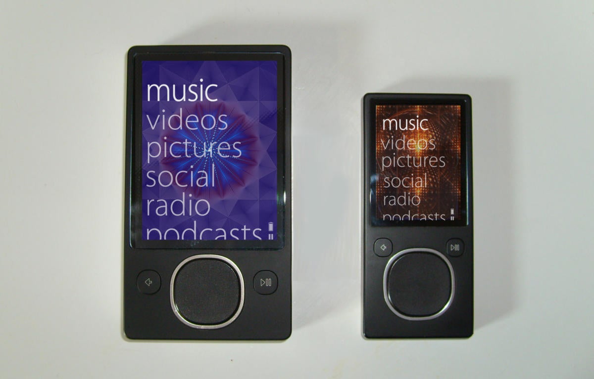
Here are two more related Microsoft products you might remember — but if you do, you certainly don’t remember them fondly. Zune was Microsoft’s answer to the iPod and Groove was a streaming music service that eventually went head-to-head with Spotify.
In each case, you know who won.
 Bkwparadox/Wikipedia
 Microsoft Zune music devices
The Zune was a me-too, over-priced, unwieldy contraption that was awful to use and inferior in every way to an iPod. I’m speaking here from personal experience – I bought one. (When you’ve covered Microsoft for years, as I have, you end up buying all kinds of crazy stuff. It’s hidden somewhere in my gadget graveyard where such objects go to die.)
As for Groove, it started out as Zune Music Pass, the streaming service for the Zune, then was renamed Xbox Music after the Zune died, and renamed yet again to Groove because…, well who knows? Maybe someone at Microsoft thought it was a groovy product name. That alone tells you how bad the service was. There wasn’t a reason in the world for anyone to use it, and few people did. Eventually Microsoft put it out of its misery.
Microsoft Band
Little-known fact: Microsoft often beat Apple when it came to releasing what would become game-changing technologies. In just about every case, it had an early advantage and still lost the war. That’s what happened with the Windows Phone.
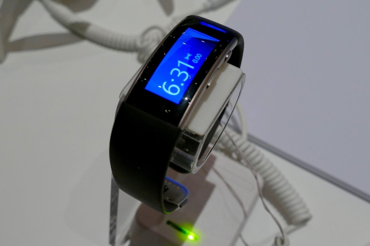
History repeated itself with a wearable wrist computer called the Microsoft Band. It was launched in October 2014, more than six months ahead of the Apple Watch. As usual, Apple did a superb job designing its product. And Microsoft…, well, it did what it so often does when building hardware — it paid little attention to usability, fit, and finish.
 James Niccolai / IDG
Microsoft’s Band 2 is displayed at the 2016 Computex trade show in Taipei
The Band was far too big and uncomfortable to wear. Its band was prone to cracking, and sometimes fell off people’s wrists. It was unreliable, had no killer features that made it a must-have, and few third parties tied into its ecosystem. Its screen was easily scratched, it wasn’t waterproof, need I go on?
In October 2016, Microsoft killed the Band. As for the Apple Watch, more than 195 million have been sold to date, and sales continue to boom.
Clippy and Bob
Microsoft doesn’t do cute. It doesn’t do funny. It doesn’t do playful. If it were a shirt, it would be a buttoned-down Oxford, not a wild-and-crazy Hawaiian or a tie-dyed psychedelic T. So, it should be no surprise that only bad, cringeworthy things happen when the company tries to draw outside the lines.
And that’s what the company tried to do with the two most embarrassing products in its history. First came Microsoft Bob, released in 1995. Bob was an interface overlaid over Windows, designed to make it easier for computer novices, children and older adults to use computers.

It was a yellow, blobby, smiley-face assistant who along with his pet dog Rover, was supposed to help you use your PC. They’d guide you through rooms, and you’d click objects in them to do things, like click a calendar or a pen and paper.
Bob was annoying, dull, stupid, irritating, slow, and so bad that Time magazine called it one of the worst 50 inventions.
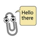
As for Clippy, it was released in 1996 for Microsoft Office 97 and made Bob look like Einstein. Clippy was an animated paperclip that sprang into obnoxious life when you wanted to do something, such as format an essay or write a letter. It would then painfully and slowly offer you not-particularly useful help. The next time you tried to do the same task, it would pop up again. In fact, even if you weren’t doing anything, it would do its best to annoy you by tapping on the screen.
How bad was Clippy? When Microsoft CEO Bill Gates announced to a crowd in 2001 it was being killed, he got a standing ovation.
Copyright © 2023 IDG Communications, Inc.
This story originally appeared on Computerworld
