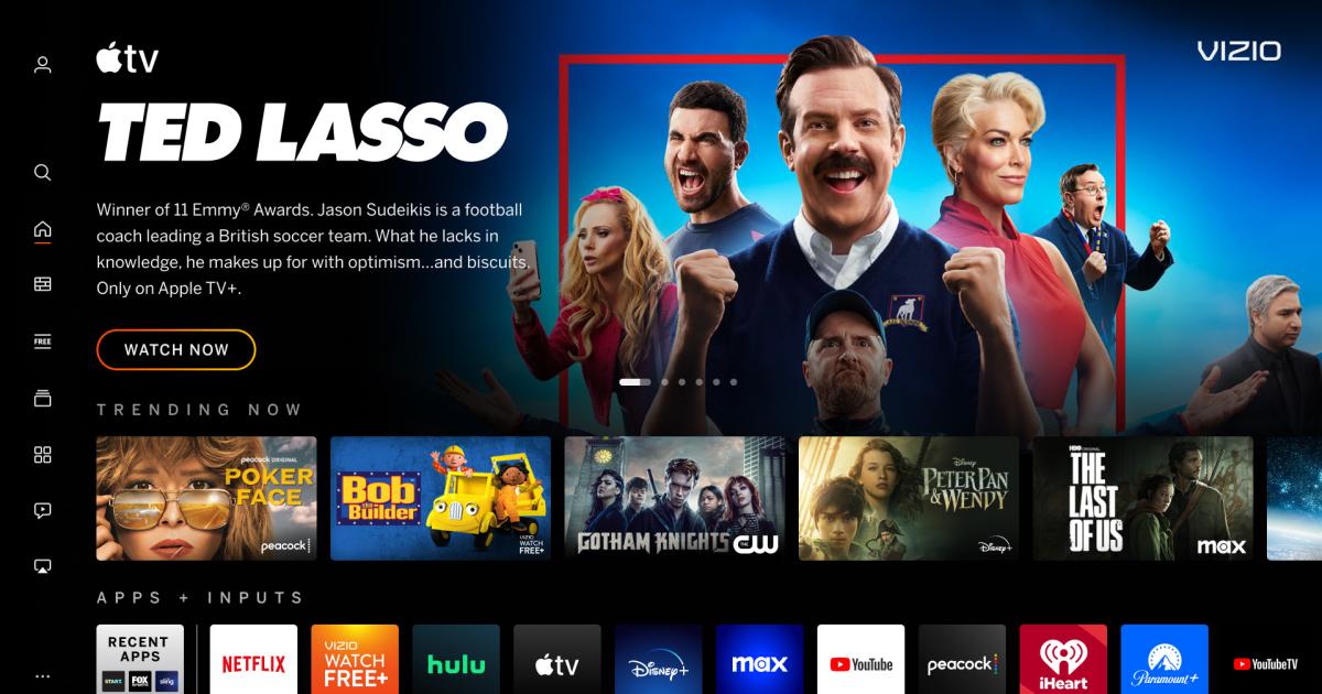
If Vizio’s TV interface has felt stale as of late, don’t worry — it’s getting a makeover. The company is rolling out a redesigned home screen that it hopes will make it easier to find content. The revamp is meant to be more intuitive, with new navigation features, menus and settings. There’s also a reworked on-screen keyboard to help you search faster.
Discovery is likewise a major focus. The updated home screen incudes recommendations as well as parental guidance and Rotten Tomatoes scores. Genre pages help you dig into a given category faster. There’s more customization, too, with a personalized “app row” that lets you flag favorites with one remote click. You’ll get recommendations on a per-app basis, and a My Watchlist section pools together movies and shows from multiple apps.
Vizio hasn’t detailed just which TV models are receiving the new home screen, or when the rollout will be complete. We’ve asked the company for more details. There’s no guarantee older sets will get the upgrade, then, but you won’t necessarily need to buy new hardware.
Interface updates aren’t new to TVs, but there is a tendency in the industry to limit major revamps to new or very recent TV sets. LG didn’t bring 2018’s webOS 4 to webOS 3 TVs released just a year earlier, for example. If Vizio delivers the new home screen to more than its latest sets, it’s providing better aftermarket support than some of its larger competitors.
This story originally appeared on Engadget

